Why Your Landing Pages Get You No Conversions and What To Do About It
Table of Contents
A high-converting landing page is a boon for any digital marketing campaign. Yet why is it that so many marketers fall short in cracking the code for a successful landing page? Don’t they know that landing pages are one of the most critical elements of inbound marketing? Are the colors too bright? What about the font size? Could the headline have been more catchy? Was the CTA not prominent enough?
Assuming you are here it is safe to say that you have tried creating a ‘perfect landing page’, but probably faltered somewhere. With this article, however, you can correct some common mistakes you’ve been making. Together, we will analyze why some landing pages don’t convert and how you can overcome these blind spots.

1. Distracting with Too Much Information
Multiple offers and CTAs get 266% fewer leads than single offer pages. Naturally, it makes no sense to clutter your landing page with irrelevant information. Rather go minimal so that the goal of increased conversion rate is achieved. Adopt the 1-1-1 strategy: 1 value proposition, 1 clear message, and 1 CTA. It will make decision-making easier for the user. To understand this better let’s take a look at Uber’s landing page.
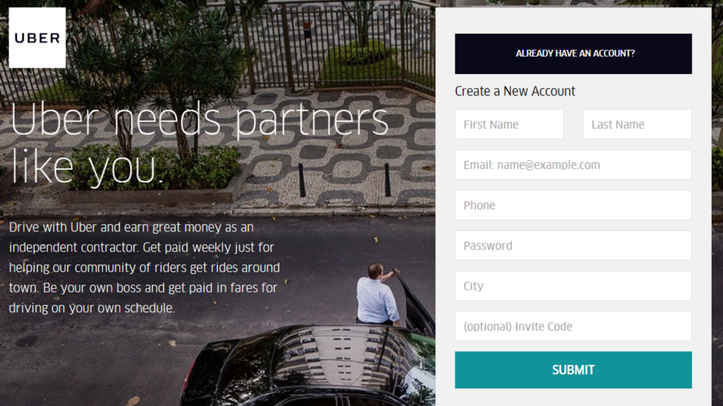
It has a short, catchy headline that highlights the campaign’s value proposition: to get more drivers on board. We also see clever use of the word “partner” as the drivers upon signing-up enters into a partnership with Uber. Moving forward, the sub-headline makes for a concise copy. It complements the headline and highlights the benefits of partnering with Uber. It emphasizes on ‘earning great money’, ‘getting paid weekly’, ‘being your own boss’ and a ‘flexible schedule’. Furthermore, there’s only ONE CTA that will naturally keep the user on the page and increase the chances of conversion. Now, that’s what being minimal means.
2. No Logical Flow
Your landing page content should have a logical flow, especially if it’s a long one. Each element should be persuasive both as stand-alone and in relation to your value proposition. This will ensure your user is cognitively engaged, isn’t confused and eventually converts from being a visitor to a subscriber. To achieve this:
#1 Begin with an impactful headline followed by benefits either as sub-text or in bullet points. It’s easier to skim through content that way.
#2 Add testimonials since it will add to your credibility.
#3 Make sure you have CTA above the fold and at the bottom of the page, above the footer.
#4 Demarcate various sections with design elements. It will be more impactful if each of it resonates with content in question.
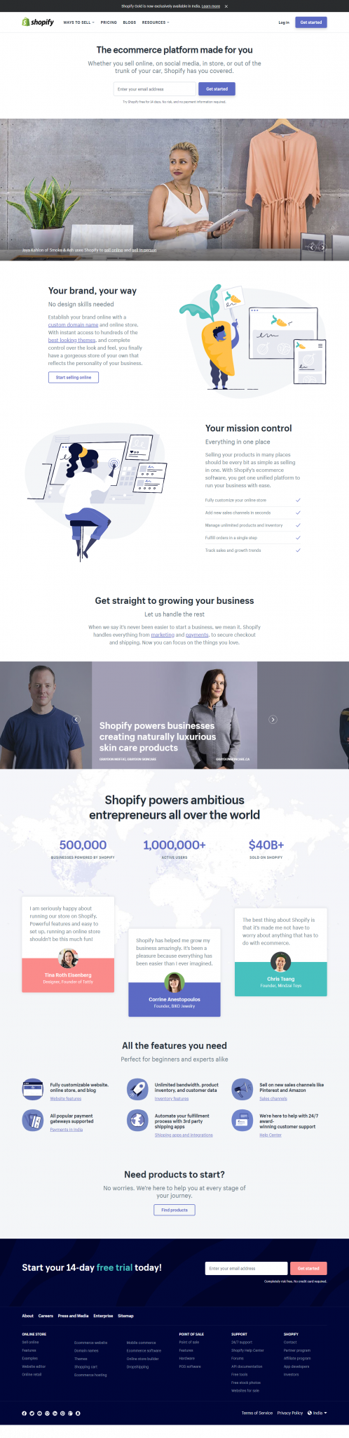
To understand what this better, let’s take a look at Shopify’s landing page.
3. Weak, Easy-to-Miss or Too Many CTAs
Focus on having just ONE CTA and let it dominate other elements on the page.
Make a compelling CTA copy that triggers a click. Use first-person copy like “Save my spot” or “Count me in”. Stay away from overused words like “submit”, “buy now”, “click here” or “find out”. HubSpot tested landing page buttons that used “submit” vs others like “click here”, “go”, download” and “register”. They found out that “submit” resulted in only 20% conversion as compared to the rest. In any case, it is better to step-up your game, stop being lethargic and become more creative when writing button text. Let’s see how Netflix creates a persuasive CTA copy.
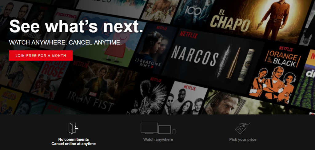
Netflix addresses a user’s pain point i.e. “what if I don’t like it” and conveys in the sub-headline that they can “cancel anytime”. They are under no ‘obligation’. And, then they place their CTA which naturally persuades them to give it a shot and ‘join free for a month’. Now, who would mind that?
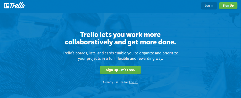
Use a color that makes your CTA stand out the way Trello does. The green stands out against the blue background. Think of the button’s size too. It shouldn’t be too small or too big that it takes attention away from the page content.
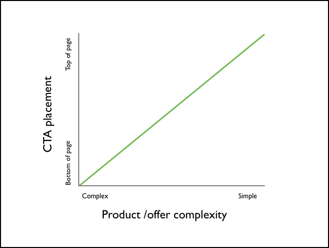
Think about the placement of the CTA as well. Have it in the first fold if the product or offer is simple. But, if there’s a lot of information for the user then having it lower down the page makes sense.
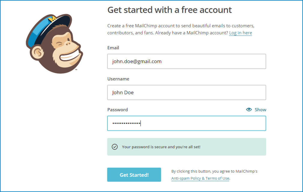
4. Asking for Too Much Information
A long lead form has low conversion because it makes users skeptic and also because it takes time and demands extra effort from the user. One of the best ways to overcome this hurdle is by reducing form fields and ask only what’s absolutely necessary. HubSpot analyzed 40,000 landing page and found out that conversion rates improved by nearly half when the text fields were reduced from four to three.
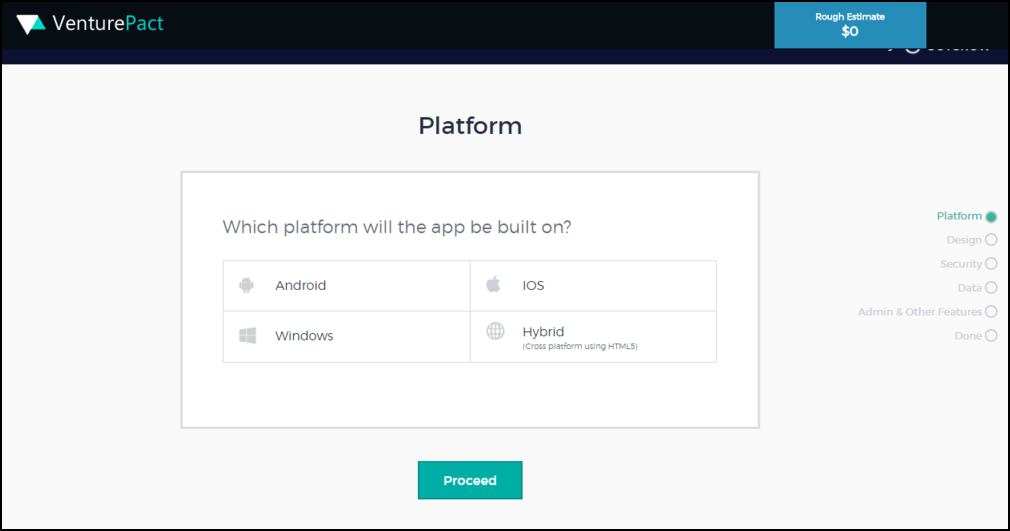
If fewer form fields don’t help your cause then try to gather information through interactive content like quizzes and calculators. VenturePact, a software development created one such calculator on the Outgrow platform. It has eight simple questions, the responses to which provide an insight into the user’s pain points want and needs. The calculator works in a way as if the user is having a conversation with a salesperson except the latter isn’t there! Not surprising that VenturePact was able to improve landing page conversions and generate 11,592 leads within two weeks of its launch!
5. Talking About Yourself
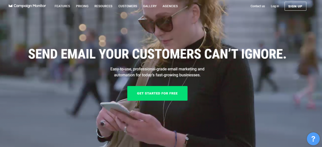
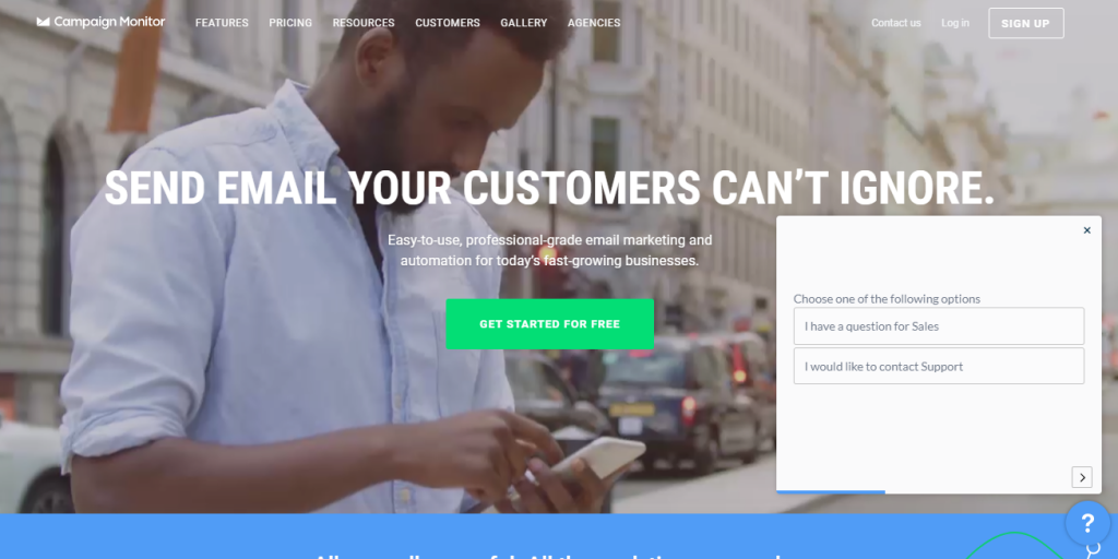
A landing page should focus on “what is in it for the user” and less about you. Think from a user’s point of view and put innovative services and product features under the limelight. Tell them how your products fit their needs. This way you convey all that you do without making it look like an ‘about us’ page. One of the perfect examples is Campaign Monitor’s landing page. The headline and the sub-headline keep benefits in focus. They stress upon the ‘easy-to-use’ functionality of the marketing software and lead them on to ‘try it for free’ button. This demands an involuntary click from a user and helps to improve landing page conversions.
6. Standard, Boring Offers
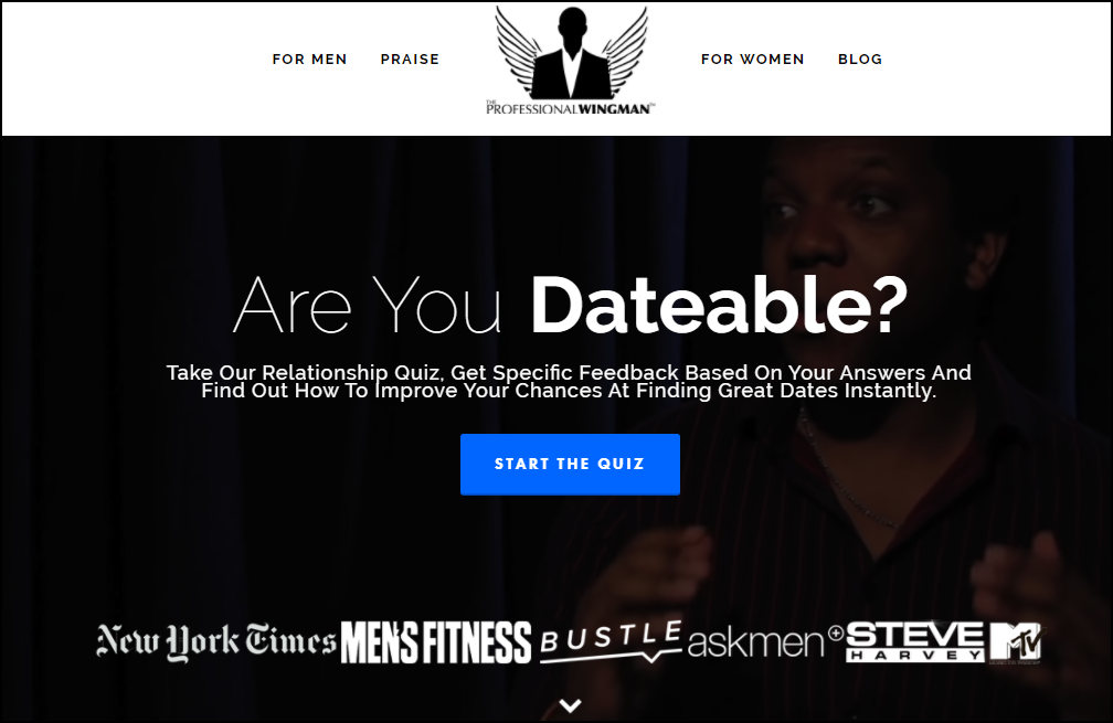
Most marketers take the predictable, easy route and offer potential leads what everyone else is offering i.e. eBooks and whitepapers. Quite obviously it doesn’t convert as much as creative offers like quizzes and calculators do. The Professional Wingman website’s landing page, for example, has a quiz. Towards the end, the user lands on a lead form which asks them to submit their name and email address to access their relationship potential report. Surprisingly, the conversation doesn’t end there.
7. Underestimating the Power of Social Proof
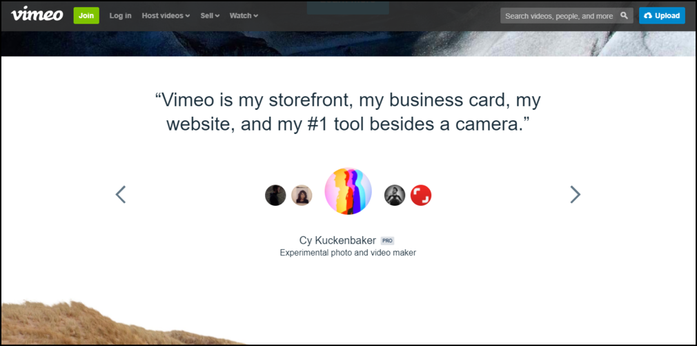
Testimonials are trust signals. In fact, 88% of consumers trust online reviews as much as personal recommendations. Seeing others trust you increase the likelihood of new users to trust you as well. That’s the power of social proof. Subtle persuasion through testimonials will be enough to make people fill out the form and walk right into your sales funnel. Though, one of the things to keep in mind is that these testimonials shouldn’t be cliché like, “They were amazing and helpful”. Use the ones which truly represent what your business did for the testimonial provider. Here’s an example of Vimeo’s landing page.
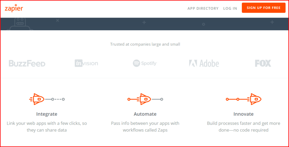
Add badges, certifications, and seals. Include client logos like Zapier does.
8. No Contact Information
Some marketers think that a headline, sub-text, form fields are enough, after all, you can’t risk cluttering the page, right? To an extent they are right too because they do their best to inject as much information as they can fit on a landing page, big or small. However, no matter how much you try, you will have some visitors with questions they need answers to. This is what makes it important to have contact info on the page, whether in form of physical address or a phone number or a chat or a contact form.
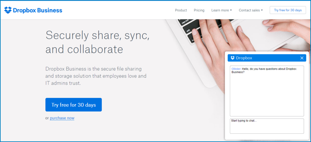
DropBox gives users a chance to connect via a chat feature. It improves the chances of converting them to leads while they are still on your landing page.
Campaign Monitor gives two options: a chat feature and another that asks them to fill a contact form.
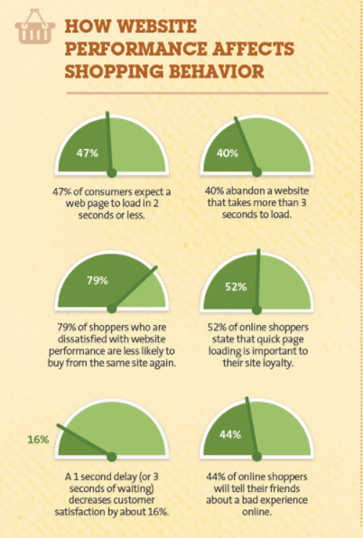
9. Landing Page Takes Too Much Time to Load
Your landing page’s load time affects the conversion rate. According to a Kissmetrics infographic, even a “1-second delay in page response can result in a 7% reduction in conversions”. In other words, if the page is slow to load then the chances of people abandoning the page are more. So, in order to make users happier and improve landing page conversions, you must get rid of the clutter, right from text to images and everything else that is a pile-on. Do test the page load time across devices.
10. Ad Copy and Landing Page Content Mismatch
Rand Fishkin, CEO of Moz calls the cohesion between ad source and landing page content, ‘conversion scent’. Unfortunately, many marketers overlook this correlation which often results in high bounce rates. One of the most obvious reasons for this is that users experience dissonance and don’t see any connection between what your ad promises and what your landing page actually offers. One way to avoid users from feeling duped and improve landing page conversions is brainstorming to create a cohesive, convincing ad copy and landing page content. In the video below, Rand Fishkin explains with an example as to how you can achieve this cohesion:
11. Not Performing Split Tests
As a marketer, you shouldn’t be passive in your approach when you know there’s always room for improvement. Do A/B tests and make sure you set conversion goals to determine success. According to HubSpot, companies with 40+ landing pages get 12 times more leads than those with five or less. So, make sure you’re testing enough. Here’s what you can do:
#1 Test minor changes like changing the button color or CTA text or hero image. Although they seem insignificant but often drastically improve conversion rates.
#2 You can also create an entirely different version of the same landing page and test the performance of both or multiple versions against the original. Make sure you split traffic to original and versions of landing pages randomly.
#3 Don’t perform these tests for too short or too long a period.
#4 Measure the impact at the bottom of the funnel. Your conversion rate may have bumped up, but did your sales increase too? Sometimes a landing page that gets you fewer leads produces more sales. So, do keep in mind all the metrics before finalizing on one landing page.
We are sure that these strategies to improve landing page conversions will help you create a landing page that converts to your expectations. But it is equally important to remember that no one formula will work. Don’t stop tweaking, testing, and experimenting to understand what’s working for you.