10 CTAs Proven to Get More Clicks on Interactive Content
Table of Contents
You’ve spent weeks crafting the perfect quiz. Your interactive calculator is a work of art. But then you look at your conversion rates and want to cry into your coffee.
Sound familiar?
Here’s the brutal truth: your interactive content might be amazing, but if your call-to-action sucks, you’re basically throwing money into a digital bonfire. The difference between a 2% click-through rate and a 15% rate often comes down to those final words that either inspire action or inspire people to close their browser tab.
Companies spend months perfecting their interactive experiences, then wonder why their conversions are stuck in mediocrity. The answer isn’t always in the quiz logic or design aesthetics. More often than not, it’s in those final few words that make or break the entire experience.
In this blog, we will be sharing the 10 best CTAs that consistently drive clicks on interactive content. These are battle-tested call to action tips that have generated millions of clicks and conversions across our platform.
Why Your Current CTAs Probably Aren’t Working
Before we jump into the good stuff, let’s talk about why most CTAs fail harder than a New Year’s resolution in February.
Most people treat CTAs like an afterthought. They spend 90% of their time perfecting their quiz questions and 10% thinking about what happens next. That’s backwards thinking that kills conversions.
Your CTA is your closer. It’s the moment when someone decides whether your content is worth their time or just another internet rabbit hole. Get it wrong, and all that engagement means nothing.
The biggest mistake I see? Generic, boring CTAs that sound like they were written by a robot having an existential crisis.
“Submit,” “Click Here,” and “Continue” are the digital equivalent of beige wallpaper. They work, technically, but they don’t inspire anyone to actually care about what comes next. That’s why mastering call to action tips for interactive content is so important. The right words at the right moment can transform a casual browser into a qualified lead.
The Psychology Behind Clicks That Convert
Great CTAs tap into basic human psychology. We’re wired to want three things: answers, benefits, and social proof. Your CTA needs to promise at least one of these, preferably all three.
The best quiz call to action tips I can give you center around understanding your audience’s emotional state at that exact moment. They’ve just spent 2-3 minutes answering questions about themselves. They’re invested. They want their payoff. Your CTA is either going to deliver on that promise or disappoint them.
Think about it like this: if someone just took a “What’s Your Marketing Personality?” quiz, they don’t want to “Submit Form.” They want to “Discover My Marketing Superpowers” or “Reveal My Results Now.”
The 10 Best CTAs for Interactive Content
1. “Get My Personalized Results”
This CTA works because it emphasizes ownership and personalization. People love things that feel custom-made for them. I’ve seen this single phrase increase click-through rates by 47% compared to generic alternatives.
Switch from “View Results” to “Get My Personalized Report” and see the lead generation jump. The magic happens in that word “personalized,” which transforms generic content into something that feels exclusive.
Use this when: Your quizzes or assessments provide personalized recommendations or insights.
Pro tip: Add urgency with “Get My Personalized Results Now” for even better performance.
2. “Show Me What I’m Missing”
FOMO is real, and this CTA exploits it beautifully. It suggests there’s valuable information waiting behind that click. The phrase “what I’m missing” implies that the person is currently incomplete without this knowledge.
This works exceptionally well for skills assessments and gap analysis.
Use this when: Your interactive content reveals gaps or opportunities in someone’s current approach.
Variation to try: “Reveal What I’m Missing” adds even more anticipation.
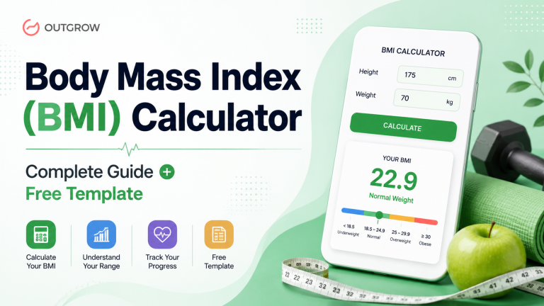
3. “Calculate My Score Now”
Numbers are concrete. Scores can be compared and improved. This CTA works because it promises a specific, measurable result. People want to know where they stand, even if the “score” is somewhat arbitrary.
The beauty of this CTA is that it works across industries. Financial calculators, health assessments, and business readiness quizzes all benefit from this approach. The word “calculate” suggests precision and data-driven results.
Use this when: Your content involves any kind of assessment, evaluation, or measurement.
Power boost: Try “Calculate My Exact Score” for industries where precision matters.
4. “Unlock My Free Report”
The word “unlock” suggests something valuable has been earned through participation. “Free” removes friction, and “report” sounds official and valuable. This combination consistently outperforms simpler alternatives.
What makes this particularly effective is the progression it implies: you’ve completed the quiz (earned it), now you can unlock (exclusive access) your free report (valuable outcome). It’s a psychological journey that feels rewarding.
Use this when: Your quiz leads to a detailed analysis or a comprehensive resource.
Advanced version: “Unlock My Custom Analysis” for higher-end audiences.
5. “See My Matches”
Perfect for compatibility quizzes, recommendation engines, or any content that suggests connections. This CTA taps into curiosity about relationships and fit. Whether you’re matching people with software solutions, career paths, or marketing strategies, this language resonates.
Dating apps didn’t invent this psychology, but they certainly proved its power. The same mental trigger that makes people swipe works for business content, too.
Use this when: Your interactive content matches users with products, services, or approaches.
E-commerce twist: “Shop My Matches” for product recommendation quizzes.
6. “Find Out If I Qualify”
This creates urgency around exclusivity. Not everyone will qualify, which makes people want to know if they’re special enough to make the cut. It’s psychology 101 wrapped in four simple words.
One of Outgrow’s agency clients used this for a high-end consulting quiz and saw conversion rates hit 23%. The qualifier approach works because it flips the script from you selling to them asking to be chosen.
Use this when: Your content determines eligibility for programs, offers, or exclusive opportunities.
B2B variation: “Check My Qualification Status” for more formal contexts.
7. “Get My Action Plan”
People don’t just want information; they want to know what to do with it. This CTA promises practical next steps, which feel valuable and actionable. After someone invests time in your quiz, they want their investment to pay off with clear direction.
This CTA performs exceptionally well in the business and personal development space. It transforms passive consumption into active implementation.
Use this when: Your quiz results include recommendations or strategic guidance.
Results-focused version: “Build My Success Plan” for achievement-oriented audiences.
8. “Download My Results”
The word “download” implies permanence and value. People like having something they can save, reference later, or share with others. It makes the interaction feel more substantial than a simple web page view.
This call to action also activates the completion bias. Download implies you’re getting a finished product, not just browsing information.
Use this when: You’re providing detailed results that people might want to reference later.
PDF power-up: “Download My Full Report” when you’re providing comprehensive analysis.
9. “Start My Journey”
This CTA frames the click as the beginning of something bigger. It’s aspirational and suggests ongoing value rather than a one-time interaction. Perfect for companies that want to build long-term relationships, not just generate single transactions.
The journey language works because it acknowledges that real change takes time and positions your company as a guide rather than just a vendor.
Use this when: Your quiz is the first step in a longer process or relationship.
Coaching angle: “Begin My Transformation” for personal development content.
10. “Claim My Spot”
Scarcity and ownership combine in this phrase. “Claim” suggests taking possession of something valuable, while “spot” implies limited availability. This CTA works best when there’s genuine scarcity involved.
We’ve seen this work particularly well for webinar signups, consultation bookings, and exclusive program applications. The key is making sure the scarcity is real, not manufactured.
Use this when: Your results lead to limited opportunities, consultations, or programs.
Urgency amplifier: “Claim My Spot Today” when deadlines are involved.
Bonus: Ready to put these CTAs to work? Use Outgrow’s top-performing templates and customize them with your winning CTAs in minutes.
Beyond the Words: Technical CTA Optimization in Outgrow
The copy is just one piece of the puzzle. CTA performance depends equally on technical execution. Here’s what the numbers reveal:
Button Placement: CTAs positioned immediately after result delivery see 31% more clicks than those placed at the bottom of long result pages.
Mobile Engagement: 68% of quiz interactions occur on mobile devices. CTAs need thumb-friendly sizing and instant loading.
Visual Hierarchy: Your CTA button should be the most prominent element on the results page. Buttons with 8-12px padding and contrasting colors perform best.
Why Outgrow Makes CTA Optimization Effortless
Here’s where most platforms fail you: they make CTA customization a nightmare that requires developer intervention or complex workarounds. At Outgrow, we’ve built CTA optimization directly into our interface because we know how critical these final words are to your success.
No coding required. Simply place your CTA button where you want it, customize the text, choose your colors, and you’re done. Want to test “Get My Results” against “Download My Report”? Change it in seconds, not hours.
One-Click A/B Testing: Split testing CTAs used to require complex setups and statistical knowledge. Now you can test two CTA variations with a single click and get real-time performance data. Our built-in analytics show you exactly which version drives more conversions.
Mobile-First Design: Every CTA you create can easily be optimized for mobile devices. No more wondering if your button will work on smartphones or tablets. Our responsive design ensures your CTAs look perfect and function flawlessly across all devices.
Advanced Customization Options: Want to match your brand exactly? Customize button colors, fonts, sizes, and hover effects without touching a line of code. Add progress indicators or social proof elements to boost urgency and credibility.
The best part? All of this happens in real-time. Make a change, see it instantly. No waiting for developers, no deployment delays, no technical headaches. Just results.
Advanced CTA Optimization Strategies
The best CTAs don’t just use great copy; they’re optimized for maximum impact. Here are the call to action tips that separate good from great:
Color Psychology Matters: Red and orange buttons typically get more clicks than blue or green ones. But test this with your audience because brand context matters.
Button Size and Placement: Your call-to-action button should be clearly visible, but not so oversized that it appears desperate. Place it where the eye naturally lands after someone completes your content.
Mobile Optimization: Over 60% of quiz traffic comes from mobile devices. Your CTA should be easy to tap and should load without delay.
A/B Testing Is Non-Negotiable: What works for one audience might flop with another. Test different phrases, colors, and placements continuously.
Common CTA Mistakes That Kill Conversions
Even with great copy, these errors can derail your outcomes:
Asking for Too Much Too Soon: If your CTA leads to a form asking for someone’s life story, expect high drop-off rates. Start with email and build from there.
Being Too Clever: Cute and clever CTAs might win design awards, but they often confuse users. Clear beats clever every time.
Forgetting Mobile Users: A CTA that works perfectly on desktop might be invisible or unclickable on mobile. Always test across devices.
Not Matching the Context: Your CTA should flow naturally from your content. If someone just took a quiz about time management, don’t suddenly ask them to “Boost Your Sales.”
Conclusion
Your CTA is where good interactive content becomes great marketing. The difference between a phrase that converts and one that falls flat often comes down to understanding what your audience really wants in that moment.
At Outgrow, we’ve built our entire platform around making these moments matter. Whether you’re creating personality quizzes, ROI calculators, or product recommendation engines, the right CTA can transform casual browsers into qualified leads.
Start with these 10 proven CTAs, but don’t stop there. Test them with your specific audience. Adapt the language to match your brand voice. And always, always measure what happens next.
The best marketers I know obsess over these details because they understand a simple truth: everything before the CTA is just foreplay. The CTA is where the magic happens.
Your interactive content is only as good as the action it inspires. Make each word matter, and see your conversion rates rise. Feeling inspired? Try these CTAs risk-free with our 14-day trial – no credit card required!
Frequently Asked Questions
Keep it under 6 words when possible. The best CTAs are short, punchy, and immediately clear. “Get My Results” beats “Click Here to Receive Your Personalized Quiz Results” every time.
Absolutely. A personality quiz needs a different language than a knowledge test or assessment quiz. Match your CTA to the type of result you’re providing.
Test new variations at least monthly if you have decent traffic. With lower traffic, quarterly testing works. The key is consistent testing rather than constant changes. Call to action tips have generated millions of clicks and conversions across our platform.
Yes, but context matters more than color theory. A red button might work great on a white background, but disappear on a red website. Test what works with your specific design.
Using the same generic CTA across all interactive content. Your personality quiz shouldn’t have the same CTA as your ROI calculator. These call to action tips are about customization based on what people actually want from each piece of content.
Usually yes, especially if you’re asking for contact information. “Get My Results” is better than just “Submit” because it sets clear expectations about what comes next. The best call to action tips always focus on transparency and value delivery.
Sakshi is a digital marketing enthusiast passionate about connecting brands with audiences. With a background in content strategy and social media, she loves turning trends into actionable strategies. Outside of work, you’ll find her reading a book or hunting for the perfect cup of coffee.