4,000 Visitors. 11 Leads. The Traffic Myth That’s Quietly Killing Your Conversions
Table of Contents
Some campaigns deserve an honest post-mortem.
Three weeks. That’s how long went into building one particular campaign landing page, four ad variations, and an email sequence mapped to the last follow-up touchpoint. Launched Tuesday. By Thursday, over 4,000 visitors had come through.
Handshakes. Backslapping. Numbers are going up on the screen.
Then somebody pulled the lead report.
Eleven leads. From four thousand visitors. People had shown up, poked around for a few seconds, and vanished. The traffic looked perfect on the dashboard. The actual outcome was, let’s be straight about it, embarrassing.
That campaign is what permanently changed how marketing success gets defined, at least for anyone paying attention to it.
The Measurement Problem Hiding in Plain Sight
Most marketers already feel the disconnect. The dashboard numbers look great. The pipeline feels hollow. The sales team keeps complaining about lead quality. And yet every Monday, the same traffic report gets celebrated.
Why does the habit stick? Because traffic is easy to generate and easier to present. Spend more money and get more visitors, and show the upward graph in the meeting. Nobody asks hard questions when numbers trend upward.
But here’s what those graphs hide: most visitors leave within twenty seconds. Not because the website failed them. Not because the product is wrong. Simply because human attention is the most fought-over resource on the internet right now, and most pages give people no reason strong enough to stay.
According to HubSpot’s marketing research, Industry conversion rates sit between two and three percent. Sometimes lower. That means ninety-seven out of every hundred people who visit a page leave without doing anything. Thirty thousand monthly visitors sounds impressive until the math gets done; twenty-nine thousand of those people felt nothing worth acting on.
The question worth obsessing over was never how many people arrived. It’s always been what happened the moment they got there.
How the Whole Content Game Broke
Something changed in the last few years, and a lot of brands got caught flat-footed.
AI writing tools didn’t just improve; they became genuinely capable of producing structured, coherent, optimized content fast. Which meant every competitor, every affiliate, and every brand with a modest content budget could suddenly publish five posts a week without straining. The internet didn’t get busier. It got saturated in a very specific way; everything started reading the same.
Readers felt it even when they couldn’t name it. A low-level numbness set in. Scroll, skim, bounce.
Doing good research still matters. Writing with specificity still matters. But quality alone stopped cutting through the noise a while back.
What actually works, proven across real campaigns in real industries and not marketing conference theory, is content where the person reading it feels like it was built around their exact situation. Not their job title. Not their industry vertical. Their actual, specific situation right now.
A blog post struggles to do that. A well-built interactive quiz or assessment does it naturally.
The Campaign That Proved It
A mid-sized financial planning firm had solid content output, reasonable traffic, and a lead quality problem that was quietly killing their sales pipeline. Inquiries kept arriving from people at the wrong life stage, wrong financial position, wrong everything. Good numbers on paper. Frustrating reality underneath.
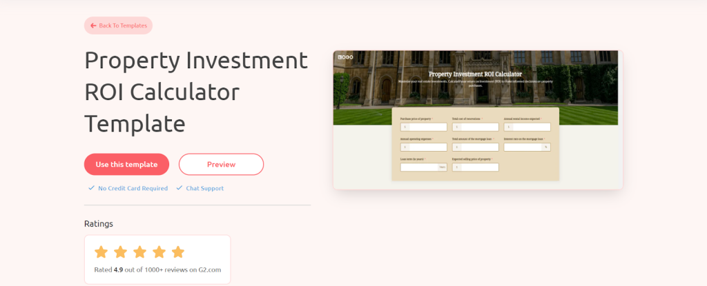
More content wasn’t the fix. A retirement readiness assessment was done.
Ten questions. Maybe four minutes from start to finish. Each person received a score at the end, not a generic range but an actual number plus a short paragraph explaining specifically what that score meant for their circumstances. No email wall blocking the result. The score was delivered immediately. Email capture is offered afterward for the full breakdown.
The leads that came back were noticeably different from day one. People arrived on calls having already worked through their own situation in a structured way. They mentioned their score. They asked sharper questions. Conversations started further down the road because the groundwork had already been done.
Assessment-to-consultation conversion rate: 18%. Everything else, including blog posts, gated PDFs, and standard lead magnets, was running between two and four percent.
There’s nothing magical about the technology. The whole thing worked because it gave people something genuinely useful before asking for a single thing in return. That sequence, value first, ask second, changes the entire dynamic of how a relationship starts.
The Formats That Actually Move Numbers
Different interactive formats attract different audiences and build different kinds of trust. It’s worth separating them properly rather than lumping them together.
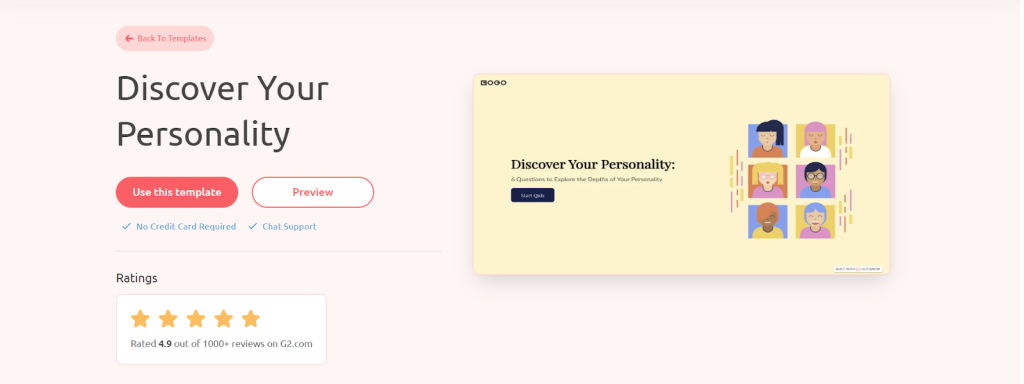
Personality quizzes consistently produce completion and share rates that raise eyebrows until the psychology behind them gets examined. “What Kind of Leader Are You?” “Which Business Model Fits Your Personality?” People have a genuine, deep interest in how they’re categorized, especially professionally. When a result resonates, it gets shared. Not as a favor to the brand. As self-expression. The brand gets carried along in that current.
Calculators pull in a different type of visitor entirely. Someone feeding numbers into an ROI calculator or savings estimator isn’t casually browsing; they’re actively working toward a decision. That level of intent makes calculator-generated leads disproportionately valuable. These aren’t people who stumbled in. People are trying to figure something out.
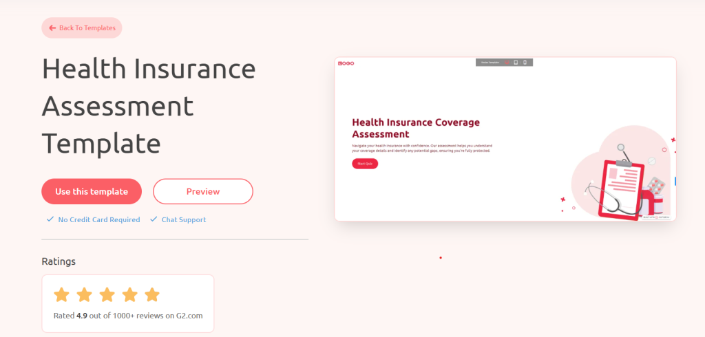
Assessments are the biggest underutilized format in B2B marketing right now, and it’s not particularly close. A marketing maturity audit. A readiness scorecard. An operational health check. These don’t read like lead generation tools; they read like something a consulting firm would put on an invoice. Giving that away for free repositions a brand from vendor to trusted advisor faster than almost anything else.
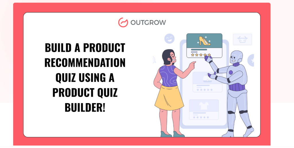
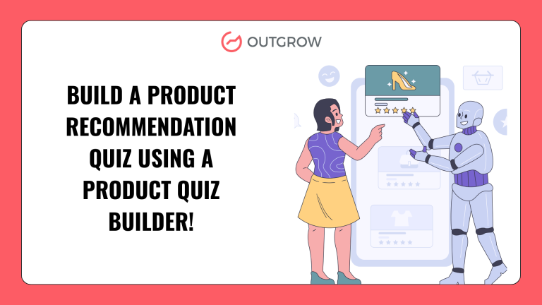
Product recommendation quizzes are consistently underestimated in e-commerce, specifically. Decision fatigue is real, and it’s costing brands sales every single day. Two hundred products in a catalog isn’t an abundance to a shopper; it’s paralysis. Six thoughtful questions leading to three specific, well-matched recommendations is the opposite of that. People buy because the hard part got done for them. Shopify’s research confirms that reducing friction in the buying journey directly increases conversion rates across product categories.
The Psychology That Makes It Stick
The completion rates on well-built interactive tools genuinely surprise most teams the first time around. The psychology behind it isn’t mysterious; it just doesn’t get talked about enough.
The self-reference effect documented in research stretching back to the seventies shows that people engage with and retain information far more deeply when it connects to their own identity and circumstances. A quiz result describing a specific decision-making pattern isn’t abstract information. It’s a mirror. Attention sharpens. Recall improves. The experience sticks in a way a blog post rarely does.
Momentum builds naturally through the process. Someone answers question three, and question four feels like the obvious next step. By question seven, stopping feels more disruptive than finishing. That’s not a dark pattern; it’s basic human psychology around commitment. Same reason a mediocre novel still gets finished past the halfway point.
The sharing behavior is worth understanding separately. When someone posts their quiz result publicly, the motivation isn’t enthusiasm for the brand. It’s identity expression showing the world how they see themselves. That insight matters for design. The goal isn’t a technically accurate result. It’s a result that feels worth expressing aloud.
Building Isn’t the Hard Part
Marketing teams still regularly assume interactive tools require a developer, a sprint cycle, and months of runway. That assumption is years out of date.
Platforms like Outgrow have removed the entire technical barrier. Drag-and-drop builders, logic branching that requires no code, pre-built templates for every major format, and direct integrations with whatever CRM and email platform are already running. A working calculator or assessment can go live in a day, provided the thinking behind it has been done properly.
Other platforms worth knowing: Typeform for conversational surveys, Interact for personality quizzes, and Involve.me for multi-format interactive funnels.
The thinking is the hard part.
Always has been. Which questions actually reveal something meaningful about the person answering? What should each result say that feels both specific and accurate? What happens to someone the moment they complete it?
That’s where performance gets determined. The platform just runs the execution.
A handful of patterns show up repeatedly in tools that convert versus tools that quietly get abandoned:
Shorter than instinct suggests. Eight questions are about where the ceiling sits before dropout starts climbing. Every question added past that point has a measurable cost in completions.
No email gate at the front door. Asking for contact information before delivering any value is the digital equivalent of charging admission before telling someone what the show is. Deliver the experience. Let people see results. The email at that point feels like a reasonable trade because something was already received.
Results that hold up under scrutiny. Four vague outcome buckets broad enough to fit almost anyone don’t pass the smell test. People spent time on this expecting something real. Vague outputs feel like a waste of that time, and that feeling transfers directly to how they feel about the brand.
Follow-up that reflects what was actually learned. Someone completes a detailed business readiness assessment. The next email they receive opens with a generic company background paragraph. That’s not just a missed opportunity; it signals that their answers meant nothing to anyone. Segment. Respond to the score. Make the follow-up feel earned.
Where These Things Fall Apart
Interactive content fails in patterns that repeat so consistently they’re almost predictable.
Everyone gets the same result regardless of what they answered. People pick up on this even without identifying exactly what felt hollow. Trust doesn’t just pause; it actively reverses.
Too many questions usually come from wanting to collect more data. The logic is understandable. The outcome isn’t. Completion rates drop off sharply past eight questions, and the people who push through to the end are a self-selected group motivated enough to finish, not representative of the broader audience.
No real follow-through is the most wasteful failure of all. Interactive content hands over qualified, self-segmented leads: people who voluntarily described their situation, their challenges, and their current readiness. If follow-up communications treat that information like it doesn’t exist, the most valuable part of the whole exercise got thrown away.
Ignoring what the data shows keeps compounding the problem. Which questions cause drop-off? Which outcomes get shared at higher rates? None of this is difficult to track. All of it improves results substantially when acted on consistently. Google Analytics and most interactive platforms provide this data out of the box. None of it is difficult to track. All of it improves results substantially when acted on consistently.
Conclusion
With platforms like Outgrow, businesses can easily create personalized experiences that convert visitors into leads and loyal customers. In a world full of content, the brands that focus on interaction and engagement will stand out and grow faster.
Every marketing format, every channel, every tactic either builds trust or slowly erodes it. There’s no neutral ground.
Generic content that could have been written for anyone erodes it quietly, not through any single failure but through accumulated forgettability.
Interactive content, built with genuine thought behind it, creates something different. A person moves through a process designed around their situation. They receive something that reflects exactly what they put in. They leave feeling correctly that the brand understood something real about them.
That feeling is genuinely rare right now. And it’s exactly the foundation that every durable customer relationship gets built on.
Traffic gets you in the room. Engagement decides what happens next.
Ready to get started? Start your free 7-day Outgrow trial.
Start for Free – Build Your First Interactive Content Experience on Outgrow Today.
Frequently Asked Questions
Any format requiring active participation: quizzes, assessments, calculators, surveys, and recommendation tools. The person contributes something, and the content responds specifically to what they gave.
Traffic measures arrival. Engagement measures what happens after arrival. One produces revenue. The other produces dashboard screenshots.
Value is delivered first; ask comes second. By the time someone has received a personalized score or recommendation, sharing an email for the full breakdown feels like a reasonable trade, not a toll.
Not with platforms like Outgrow. The technical side is built into the platform. The actual skill required is knowing the audience well enough to write questions that reveal something real.

I am a Digital Marketing Enthusiast with a passion for optimizing content and paid marketing strategies. Continuously seeking innovative approaches to boost ROI and engagement at Outgrow.