Introduction
Table of Contents
You’re about to launch a new feature. Your team’s been grinding on it for months. But here’s the thing: you’ve got no idea if users will actually love it or ghost it after two days.
That’s exactly why you need a solid ux survey example. And I don’t mean those soul-crushing questionnaires people bail on after the second question. I’m talking about surveys that people actually finish, and that give you real data you can use.
Over the last five years, I’ve run hundreds of user experience surveys. Some crashed and burned hard. But others? They pulled in response rates over 40% and gave us insights that shaped million-dollar product decisions.
This guide shows you what actually works. You’ll get real ux survey example templates, learn exactly when to use each one, and figure out how to build Outgrow surveys people don’t immediately close.
What Makes a Great UX Survey Example
A great ux survey example does three things: respects your user’s time, asks questions that actually matter, and makes answering stupid easy.
Keep your surveys to take when bored under 3 minutes. Go longer and watch your completion rates nosedive. I learned this lesson the expensive way, launched a 15-minute survey once, and got a pathetic 7% completion rate. Cut it down to 2 minutes? Shot up to 38%.
What actually works in user experience surveys:
- One clear objective (Are you measuring satisfaction? Finding pain points? Testing something new?)
- 5-10 questions max for general surveys
- Mix of number ratings and open-ended questions
- Works great on phones (more than 60% of people take surveys on mobile)
- Progress bar so people know they’re almost done
The best ux survey example templates use branching logic. Someone rates their experience as terrible? They get different follow-ups than someone who loved it. These are the surveys to do when bored so we have to ensure and keeps things relevant and quick.
Types of UX Survey Examples You Should Know

Post-Task Surveys
These pop up right after users finish something on your site or app. Perfect timing because everything’s still fresh in their head.
A solid post-task ux survey example asks stuff like:
- How easy was it to complete this task? (Scale 1-5)
- Did anything trip you up?
- What would make this smoother?
SaaS companies dig these because you can see how satisfaction shifts with each update. When Dropbox tested their new file-sharing flow, post-task surveys showed a 23% bump in how easy people thought it was.
Website Satisfaction Surveys
These satisfaction survey templates are the surveys to do when bored and measure how people feel about your site overall. Best trigger? After someone has spent at least 2 minutes browsing or checked out 3+ pages.
The classic ux survey example here includes Net Promoter Score (NPS): “How likely are you to recommend our website to a friend?” Then follow with “What’s the main reason for your score?”
You can create a surveys to take when bored for free with tools that let you customize when and where they show up. The secret is catching users at just the right moment.
Feature Request Surveys
Want to know what to build next? Just ask. These surveys to take when bored, let users tell you directly what they need most.
A smart feature request ux survey example shows 5-7 possible features and has users rank them. Throw in an open field for wild ideas, too. Some of our best features came from those random suggestions.
Usability Testing Surveys
These surveys to do when bored dig into specific problems. Run them alongside actual usability tests where you’re literally watching people use your product.
Your usability ux survey example needs to ask:
- What was the toughest part of this task?
- What did you think would happen when you clicked [X]?
- On a scale of 1-7, how frustrating was this?
- What would you change?
One e-commerce client found out through these that 34% of users couldn’t even find the shopping cart icon. The designer made it “minimal and elegant,” but users thought it was just decoration. Switched to a standard cart icon, and checkout started jumping 18%.
Exit Intent Surveys
These show up when someone’s about to bail on your site. You’ve got maybe 5 seconds to grab them.
Keep your exit intent ux survey example to one or two questions tops:
- “What made you decide to leave today?”
- “Did you find what you were looking for?”
Exit survey data tells you exactly where you’re bleeding users. One SaaS tool we worked with discovered 41% of visitors left because pricing wasn’t clear. Added a simple comparison table and cut exits by 29%.
How Outgrow Interactive Content Transforms Your UX Surveys
Here’s what most people miss: static surveys get mediocre results. Interactive content? Game changer.
Outgrow lets you build interactive quiz experiences that feel like actual conversations instead of interrogations. Instead of boring form fields, you’re creating stuff users genuinely want to complete.
Why interactive surveys crush traditional ones:
Users finish interactive Outgrow surveys at rates 2-3x higher than regular forms. The engagement factor is huge. Turn a survey into an online quiz maker experience, and people stop seeing it as work; they actually get interested.
The branching logic in Outgrow means everyone gets a personalized path based on how they answer. Someone frustrated sees totally different questions than someone happy. That relevance keeps people going till the end.
You get real-time analytics showing exactly where people drop off, which questions get skipped, and what responses link to desired actions. This data lets you keep tuning your surveys.
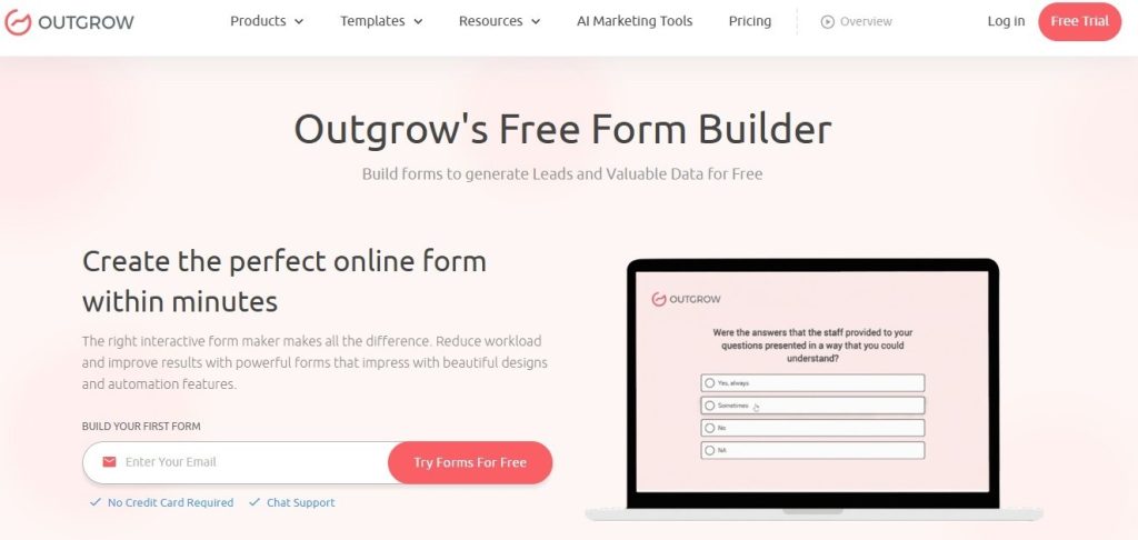
Building forms doesn’t need coding anymore. With a free form builder, you can whip up professional surveys in under 30 minutes. Drag questions around, add your branding, set up the logic, and launch.
Visual appeal matters way more than you’d think. A good-looking survey using quiz software can boost completion rates 20-30% compared to plain text forms. People judge quality by looks, and a polished survey shows you actually value their input.
For teams testing different versions, you can build online form templates and A/B test different question orders, wording, and designs. This testing often reveals weird insights about what language actually clicks with your audience.
Lots of companies start with free surveys to test things out. Outgrow’s got options that let you launch fast without spending money up front. Once you see those response rates and data quality, scaling up is easy.
Real-World UX Survey Example Templates
Customer Satisfaction Survey Template
This ux survey example works for SaaS products, e-commerce sites, service businesses, pretty much everything:
Q1: How satisfied are you with [product/service]?
- Very satisfied
- Satisfied
- Neutral
- Dissatisfied
- Very dissatisfied
Q2: What do you value most about [product]? (Pick up to 3)
- Ease of use
- Features
- Customer support
- Price
- Reliability
- Other: ______
Q3: What would make your experience better? [Open text field]
Q4: How likely are you to keep using [product]? [1-10 scale]
Q5: Can we contact you about your feedback?
- Yes [email field]
- No
Takes 90 seconds to finish and gives you both numbers (satisfaction scores) and real insights (what they care about, what needs fixing).
Onboarding Experience Survey
New users see things with fresh eyes. This ux survey example captures those first impressions:
Q1: How easy was it to get started? [1-5 scale: Very difficult to Very easy]
Q2: Did you complete your first [key action]?
- Yes
- No, but I’m planning to
- No, I’m not sure how
- No, I don’t need to
[If “not sure how” → What stopped you?]
Q3: What confused you during setup? [Open text]
Q4: How does [product] compare to what you expected?
- Better than expected
- Met expectations
- Below expectations
Q5: What made you sign up? [Open text]
One mobile app used this and discovered 52% of users didn’t get their core value until day 3. They redesigned the welcome flow to explain it upfront and saw 7-day retention jump 31%.
Product Feedback Survey
When you’re tweaking features, this ux survey example gets specific:
Q1: Which features do you use most? (Check all that apply) [List your main features]
Q2: Which feature(s) do you find most valuable? [Ranking question with the same features]
Q3. Missing features: Are there any major capabilities you feel are lacking?
Q4: Top priority: If only one improvement were possible, which would matter most?
Q5: Workflow fit: How does [product] integrate into your workflow?
The gap between “most used” and “most valuable” reveals cool stuff. One project management tool found that its calendar was constantly used but rated low on value. People needed it but found it clunky. That feedback drove their roadmap for six months.
Website Navigation Survey
Lost users mean lost money. This ux survey example finds navigation problems fast:
Question 1: Were you able to find what you were looking for?
- Yes, easily
- Yes, but it took some digging
- No
[If “No” → What were you trying to find?]
Q2: How would you rate our site navigation? [1-5 scale: Confusing to Intuitive]
Q3: Was any part of the site confusing? [Open text]
Q4: How can we make it easier to find things? [Open text]
A B2B software company ran this and learned users couldn’t tell the difference between their “Solutions” and “Products” pages. The content basically overlapped. They consolidated into one clear section, and time-on-site jumped 24%.
Mobile App Experience Survey
Mobile users act differently from desktop folks. This ux survey example catches mobile-specific issues:
Q1 How often do you use the mobile app?
- Daily
- Weekly
- Monthly
- This is my first time
Q2: How would you rate the app’s performance? [1-5 scale: Slow/Buggy to Fast/Smooth]
Q3: Have you had crashes or errors?
- Yes, frequently
- Yes, occasionally
- No
[If “Yes” → When does this happen?]
Q4: What would make the app more useful? [Open text]
Q5: Do you prefer the app or website?
- App
- Website
- No preference
One fintech app learned through this that users loved the app but switched to desktop for certain complex stuff because the mobile flow was too complicated. They simplified those flows, and mobile transactions shot up 43%.
Five Industry-Specific UX Survey Example Use Cases
E-commerce: Shopping Cart Abandonment Survey
Online stores lose about 70% of shoppers at checkout. This ux survey example shows you why:
An athletic wear brand triggers this when someone abandons their cart:
Trigger: User adds items to cart, starts checkout, then tries to exit
Question: “Before you go, what made you decide not to finish your purchase today?”
- Shipping costs are too high
- Changed my mind about the product
- Just browsing/comparing prices
- The website had technical issues
- Payment options limited
- Other: ______
They found 38% cited shipping costs. Tested free shipping over $75 and conversion jumped 26%. That survey paid for itself in two days.
For abandoned carts, timing’s everything. Send an email with this online survey free link within 2 hours. Wait 24 hours, and response rates tank 60%.
SaaS: Feature Adoption Survey
Software companies need to know which features actually drive value. This ux survey example identifies your power features:
A project management tool sends this after 30 days:
Q1: Which features have you tried? (Select all)
- Task lists
- Gantt charts
- Time tracking
- Team chat
- File sharing
- Reporting
Q2: Which feature saves you the most time? [Single select from above]
Q3: Which features seem useful but you haven’t figured out yet? [Multiple select]
[For “haven’t figured out” picks → Would you like a quick tutorial?]
This showed them 67% of users never even found their reporting feature, which was a key differentiator. They added a guided tour highlighting reports, and paid upgrades rose 19%.
You can create a survey for free that auto-segments users by feature adoption. Low-adoption users get different messaging than power users.
Healthcare: Patient Experience Survey
Medical practices need feedback, but patients are slammed. This ux survey example respects their time:
A dental clinic sends this via text after appointments:
Q1: How was your appointment today? 😀 Great | 🙂 Good | 😐 Okay | 🙁 Poor
Q2: [If Great/Good] What did we do well? [Open text, optional]
Q3: [If Okay/Poor] How can we improve? [Open text, optional]
Q4: How likely are you to recommend us? [1-10]
The emoji rating gets 3x more responses than numbered scales. Keep it simple, and you’ll get real feedback.
One practice found 84% of “Poor” ratings mentioned long waits. They started texting people when appointments ran late. Patient satisfaction jumped 31%.
Education: Online Course Feedback Survey
EdTech companies need to know what’s working in courses. This ux survey example gets specific:
An online learning platform sends this after students finish a module:
Q1: How clear were the learning objectives? [1-5 scale: Unclear to Very clear]
Q2: What teaching method worked best for you?
- Video lectures
- Reading materials
- Interactive exercises
- Quizzes
- Discussion forums
Q3: What topic needs better explanation? [Open text]
Q4: How long did this module take you? [Time estimate]
Q5: Was this module too easy, just right, or too difficult? [Three options]
They found that students rated video lectures highest, but actually learned more from interactive exercises (based on quiz scores). They added more interactive stuff, and course completion rose 28%.
Using survey tools’ free options, they A/B tested timing. Sending right after module completion got 41% responses vs. 18% when sent 24 hours later.
Financial Services: Digital Banking Survey
Banks need to know how users feel about digital experiences. This ux survey example focuses on trust and usability:
A regional bank triggers this after 5 mobile logins:
Q1: How secure do you feel using our mobile app? [1-5 scale: Not secure to Very secure]
Q2: What task do you do most often in the app?
- Check balance
- Transfer money
- Pay bills
- Deposit checks
- Other: ______
Q3: Have you had problems with the app?
- Yes [Open text: What happened?]
- No
Q4: What feature would make banking easier for you? [Open text]
Q5: How does our app compare to other banking apps you’ve used?
- Much better
- Somewhat better
- About the same
- Somewhat worse
- Much worse
Their survey showed 44% of users had no clue they could deposit checks by photo. They added a big tip on the home screen, and mobile check deposits jumped 67%.
For sensitive stuff like finance, using a free online survey tool with proper security (SSL encryption, GDPR compliance) builds trust.
Wrapping This Up
The difference between a ux survey example that works and one that bombs comes down to three things: asking the right questions, asking at the right time, and making it painless to answer.
Start small. Grab one survey type from this guide that matches your biggest question right now. Use a free survey maker to build it, test with 10 people, tweak it, then roll it out.
Data from well-designed user experience surveys beats guesswork every single time. I’ve watched teams waste months building features nobody wanted because they never bothered to ask. Don’t be that team.
Your users actually want to tell you what they think. Just make it easy for them. Build your surveys with that in mind, and you’ll get response rates and insights that genuinely improve your product.
The ux survey example templates here give you a starting point. Customize them for your situation, test different versions, and pay attention to which questions generate useful responses. That’s how you build a survey practice that actually moves things forward.
Ready to start? Grab a free form builder and create your first Outgrow survey today. You’ll have data rolling in by tomorrow that tells you exactly what your users need.
Frequently Asked Questions
A UX survey example is largely a template or sample questionnaire aimed at soliciting feedback from users regarding their experience of a product, website, or service. Ux surveys normally consist of 5 to 10 questions aimed at measuring customer satisfaction, pain points, and opinions for improvements.
Typically, most surveys about user experience will have 5 to 10 questions. Go beyond that, and you will notice that completion rates will drop off a cliff. Want more in-depth feedback? Space that out over several mini-surveys that fire off at different stages.
An example ux survey is where you collect information from users with questions, while user usability testing is where you observe the way your users use your application and make mental notes where these users find difficulties.
There are tools like Outgrow that allow you to create professional-looking surveys for free without coding. Others would include Typeform, Google Forms, SurveyMonkey, and Qualtrics. Just select one depending on your requirements with regard to branching logic, analytics, and integration with the applications you use.
Conduct constant feedback surveys (such as post-task or exit intent) with small groups. Conduct full-scale satisfaction surveys quarterly or post-large patch updates. Do not let survey fatigue occur, and space out surveys of the same users, ideally no more than once every 3-6 months.

Muskan is a Marketing Analyst at Outgrow. She is working on multiple areas of marketing. On her days off though, she loves exploring new cafes, drinking coffee, and catching up with friends.