How to Use Marketing Psychology to Create High Converting Landing Pages
Table of Contents
This blog is all about creating high-converting landing pages using Psychological Factors!
Every waking hour of our lives, we are inundated with choices. Should I eat cereals for breakfast or a croissant? Maybe I should go for a movie or just sit back and binge-watch F.R.I.E.N.D.S. Perhaps, I should go to Ibiza or just save all that money to buy a penthouse one day! True, right? It all comes down to choosing one over another. What a curious thing our brain is!
Confused as to why we are talking about the psychology of choice instead of some game-changing marketing concept? That’s because there is an unmissable link between marketing and psychology. As marketers, one of the things we often ponder about is conversion. Why is it that despite a heavy footfall on our landing pages, our funnel is still far from being full of quality leads? Simple – because our target audience evaluates our landing pages – consciously and subconsciously – before taking our bait. While it may seem their choice is independent of any biases and influences but it’s not.
For that very reason, it’s important that you learn what psychological factors trigger a prospect to behave a certain way. Armed with this knowledge you can easily design ridiculously persuasive and converting landing pages! Let’s begin, shall we?
1. Psychology of Pleasure
It is a human instinct to pursue anything that gives us happiness. If you keep that in mind, and your prospect’s quintessential search for ‘happiness’ at the center, your landing page will convert. The opposite is also true i.e. if you confuse, annoy, and underwhelm them they will abandon your page instantaneously. The question now is how do you make your prospects happy?
(a) State your value proposition with clarity
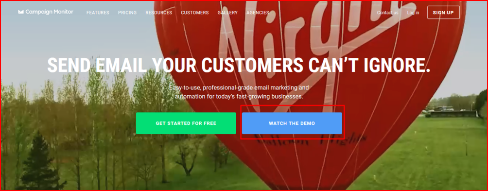
The first question that springs into a visitor’s mind when they are on a landing page is “What’s in it for ME?” Unless you state your value proposition with utmost clarity, you will lose them. In this light, let’s examine Campaign Monitor’s landing page. The headline is on point. The sub-text elaborates on its “easy-to-use” feature and “professional grade”. Next, the CTAs are hard to miss and prompt immediate action. Since everything is clearly laid out the user doesn’t have to go around in circles figuring out what Campaign Monitor actually does.
(b) Lure them with ample social proof
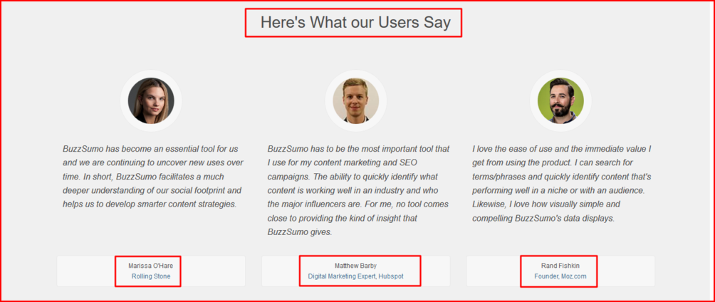
When people aren’t sure how to act, they look for help from other people. That’s called social proof. They want these other people to assure them that they are taking a sound decision. This is why a lot of websites put testimonials, trust badges, and seals on their homepage. You can use it on your landing page too and facilitate decision-making for your customers. Seeing your clients vouch for your excellence will make for ‘happy’ experience and bump up conversion rates. Take a lesson from BuzzSumo. They host testimonials from their top clients, who also happen to be industry influencers, on the homepage to indicate social proof.
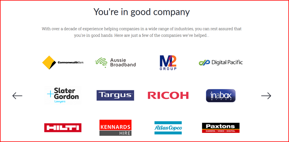
Another agency that makes the prospects happy by assuring them that they are in good hands is Webprofits.
We believe media mentions can solidify your brand reputation. See how Christina Greve makes use of it at the bottom of her workshop’s landing page.
(c) Render a smile with striking visuals
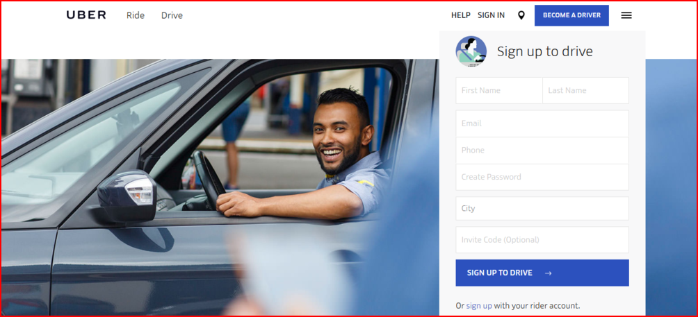
Humans are visual beings. Half of our brain is either directly or indirectly processing visual data. This means that your prospects are simultaneously processing images and text. However, since images are easier and almost 60,000 times faster to process than text, they will have already made a decision on whether to read the rest of the page. So, you better have impressive images (forget stock photos) on display to please your prospect. Look at Uber’s landing page that motivates drivers to sign up and what can be a better picture than show someone happy in the driver’s seat?
(d) Get rid of pile-on content to speed up page load time
According to a Kissmetrics infographic, even a “1-second delay in page response can result in a 7% reduction in conversions”. It happens mainly because it’s annoying to WAIT for the page to load. If you want to keep your prospects in good spirits then test the loading time of your landing page.
2. Cognitive Fluency
Cognitive fluency is a BIG DEAL! It basically means how easy is a piece of information to process. The easier the page content is to understand, the quicker your prospect makes a decision. However, if you confuse them with too much content or too many options then they will get restless and leave. So, how do you reduce their cognitive effort?
(a) Write SIMPLE and EFFECTIVE headlines
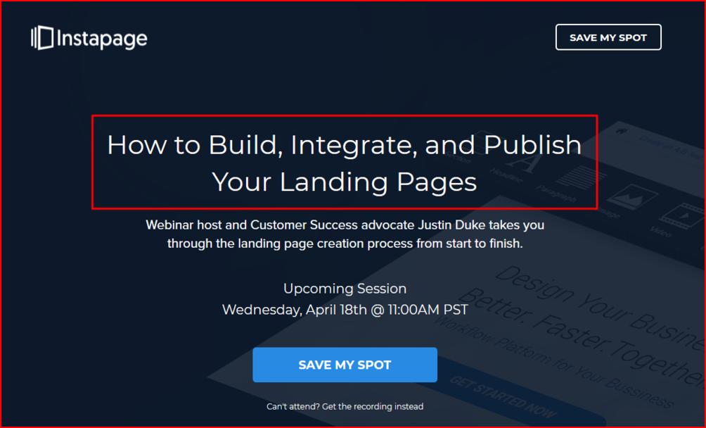
Let’s start by talking about Instapage’s landing page. The headline states the value proposition. It prompts the user to read the rest of the content and eventually click on the CTA. Notice the use of “your”? It’s what called keeping the user at the center and making it about them. In addition to the headline, what we like about their landing page is that they make it easier for those who can’t attend the webinar to “get the recording”. Conversions galore!
(b) Logical flow of content
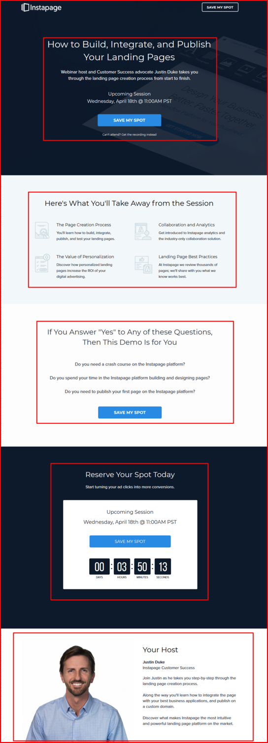
We will continue with the same example to understand this point. If you see, Instapage has divided the landing page into sections. Each one is persuasive as a stand-alone element and in relation to the offer. This presentation of information in five digestible chunks reduces a visitor’s cognitive effort and eases decision-making.
(c) Clever use of typography and font
Ready with a perfect content copy? Excellent! Now, your entire focus should be on typography, as it has a huge impact on conversions. If the letters are too close together, the typeface size is too small, or the spacing between words is not optimal, then the conversion rates will automatically drop.
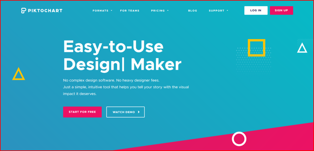
One of the most effective strategies to make content easy to read is to establish an information hierarchy by using fewer fonts. See Piktochart’s landing page to understand this better. The font hierarchy guides the user further down the page. There is no cognitive effort whatsoever put in by the user.
3. Color Theory
We’ve talked about creating content for the mind. Now let’s talk about color. According to a study by Satyendra Singh, 62-90% of the brand assessment is based on colors alone. Given the fact that colors can influence a user’s perception of your brand, you should be careful about the color choice on your landing page. Go for a combination that is both pleasing to the eye and appealing to the mind. If you aren’t prudent in your choice, your brand will be perceived as shoddy, cheap, and inexpressive!
Having said that, you should also know that there isn’t any ONE best color that will bring your maximum conversions. For instance, for a CTA, you may feel ‘orange is rather a loud and boastful color’ but it can be offset if it is put against a contrasting background. This is known as the Isolation Effect or the Von Restorff effect. According to this color theory, anything that stands out will get maximum attention and be remembered. Here’s how Eben Pagan uses the color theory on his landing page. See the difference?

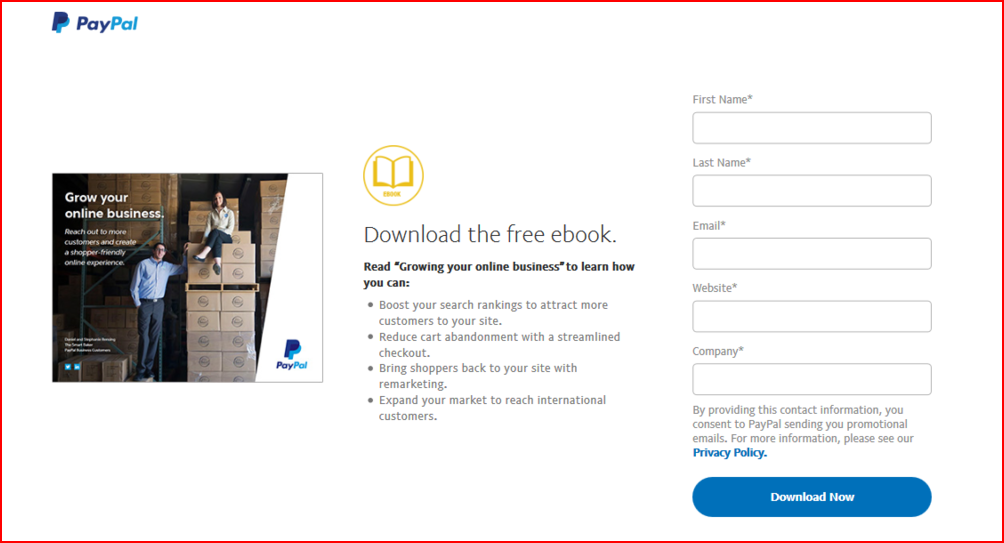
Again, you may think blue is rather dull and boring but it is one of the most preferred colors by people worldwide. Here’s how PayPal uses it on its website against a contrasting, white background. The color theme is in sync with their brand logo too.
4. Loss Aversion
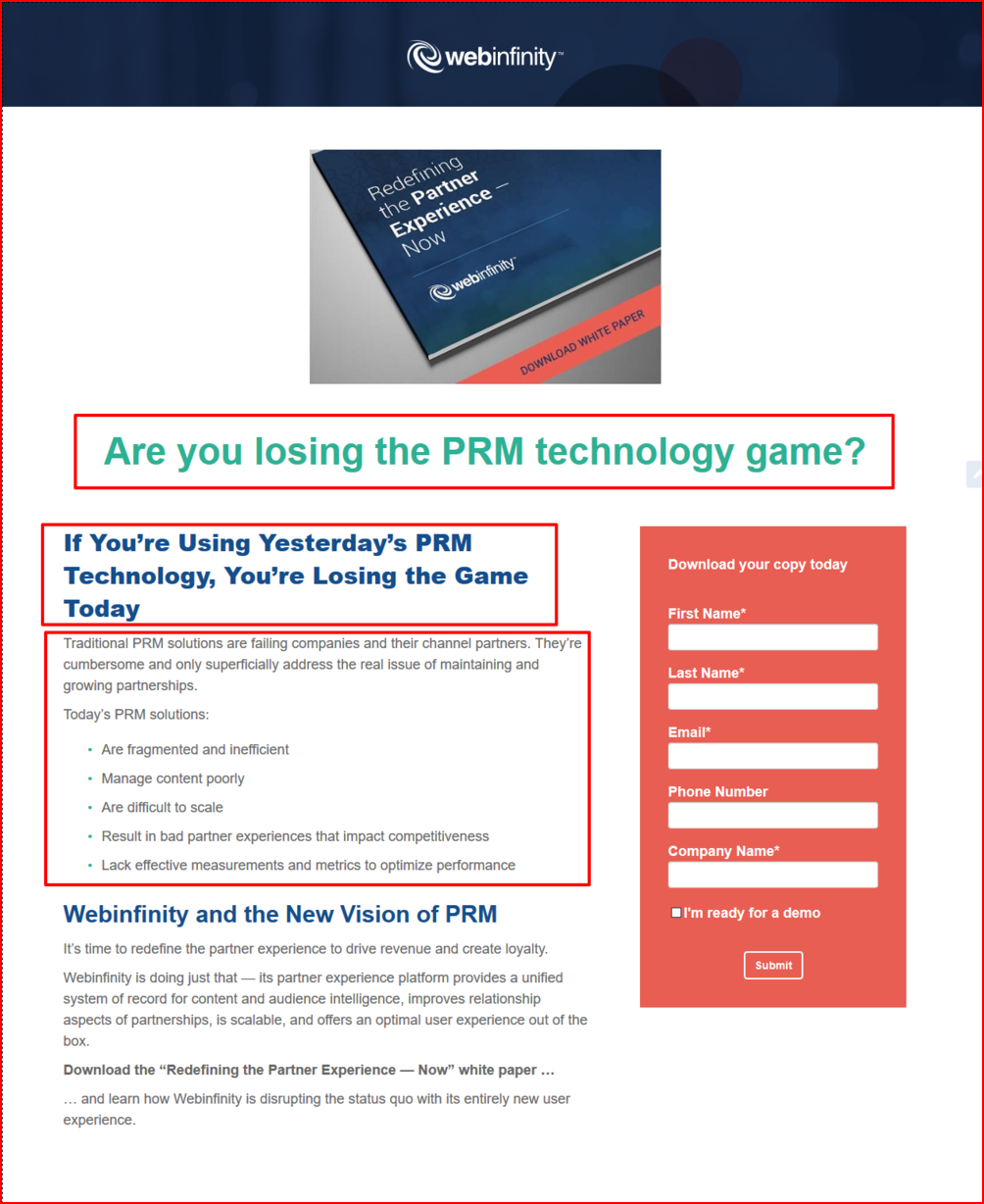
Turns out losses terrify us and we would do anything to avoid them. The moment we anticipate a loss, we contemplate an action to keep losses at bay. Seems like the digital team at Web Infinity understood how they could play loss aversion sentiment in their favor. They ingeniously play upon the ‘current painful situation’ of all those using traditional PRM technology before finally plugging in their product. They don’t reveal the benefits and create a knowledge gap. Naturally, people will download the whitepaper because now they know they are at a ‘loss’ and would want to get out of it by reading how Web Infinity can save them.
Free trial is another effective loss aversion strategy. Give them enough time to get acquainted with and used to your product. The moment they hear their “free trial” is about to end, they are very likely to convert from a prospect to a customer.
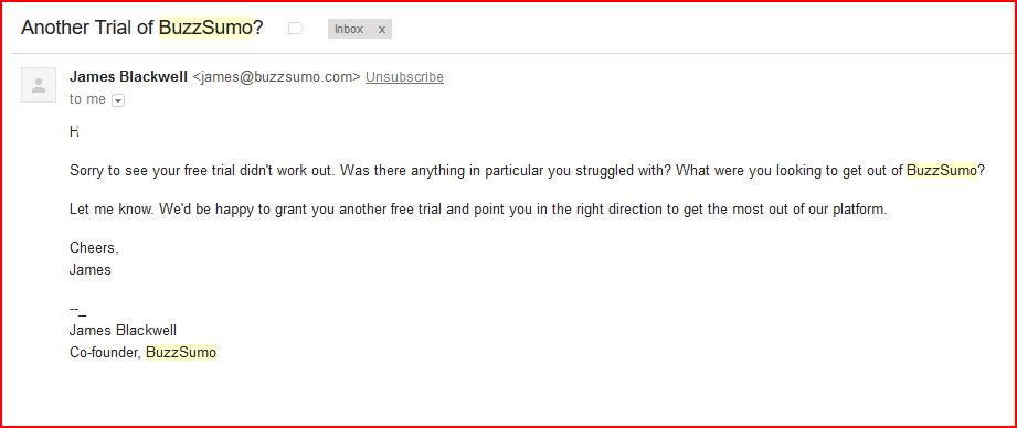
To evoke a sense of fear, you can follow-up with emails reminding the user to upgrade or offer an extension of free trial (I got an email from BuzzSumo; screenshot below). Perhaps, even send them bonus coupons that will motivate them to avert loss by becoming a paying member.
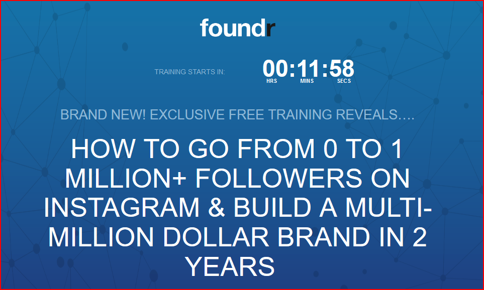
You can also pack a punch on your landing page by running a time ticker. By creating an element of scarcity your visitors sense an impending loss of something valuable and so conversions kick in!
5. Reciprocity
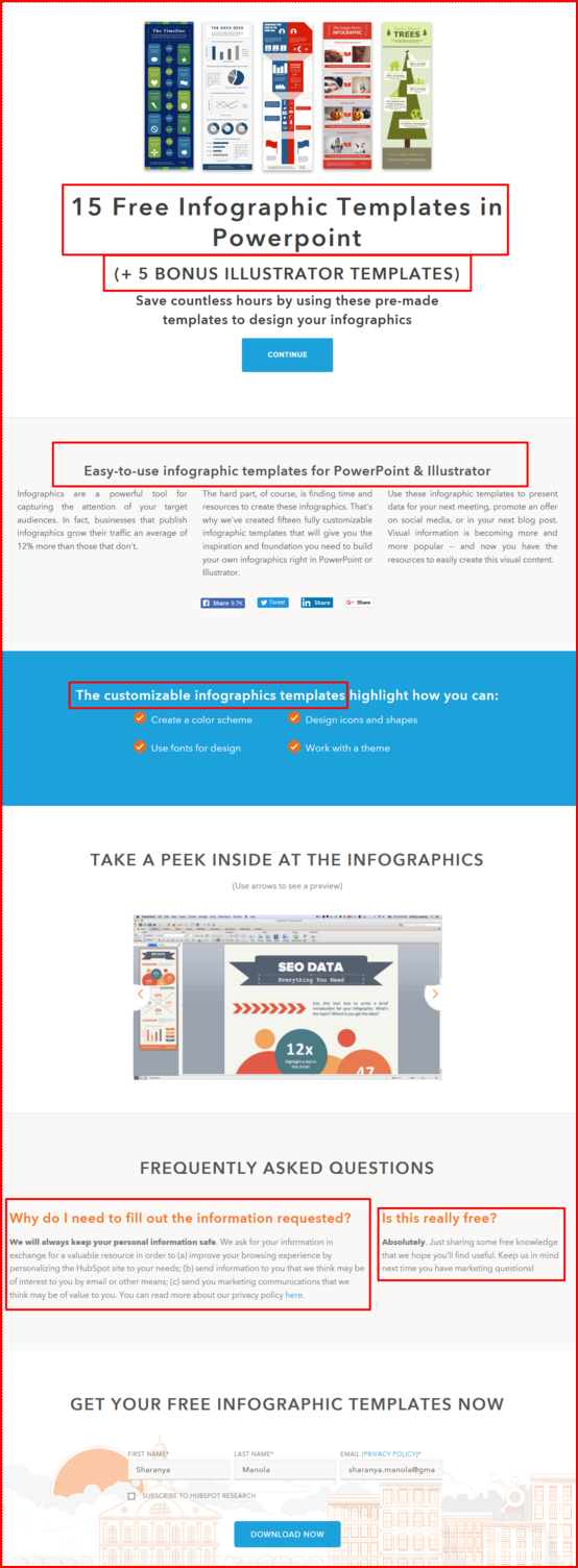
An act of kindness will be well-received and the recipient will, in turn, be compelled to return the favor – so goes Robert Cialdini’s principle of reciprocity. In simple words, you give a little, you get a little. HubSpot does this wonderfully on one of its landing pages. They build their case on why you should download these infographic templates, right from the beginning. In addition to the 15 templates, they add 5 bonus templates to the offer (the user is impressed by this generous gesture!) They could have stopped at that but they go on and highlight the benefits of publishing infographics and make the ‘free’ offer seem more valuable! The fact that the templates can be customized also works in their favor. All the more reason for the users to sign up!
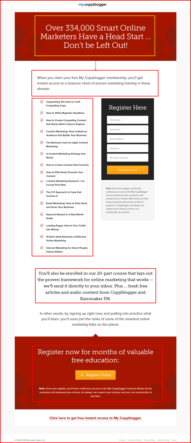
Another example is the membership landing page of CopyBlogger. They focus heavily on the aspect of free resources including blogs, ebooks, and courses. Why would anyone who is getting valuable content for free (thank you, Copyblogger!) not return the favor by filling up the lead generation form?
6. Decoy Effect
According to Behavioral Economics, “the decoy effect is technically known as an ‘asymmetrically dominated choice’ and occurs when people’s preference for one option over another change as a result of adding a third (similar but less attractive) option.” Simply put, people change their preference between two options once they are presented with a third option. Strange but that’s what brings conversions on pricing pages.
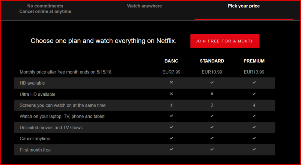
You too can achieve the same effect on your landing page. Present your prospects with a third option and influence purchase behavior by making it seem like a better bargain. Just make sure it is closer to the high-priced option and features only marginally better than the low-priced plan. Netflix gets it right by flanking the basic and premium membership with a strategic, standard membership as the decoy option.
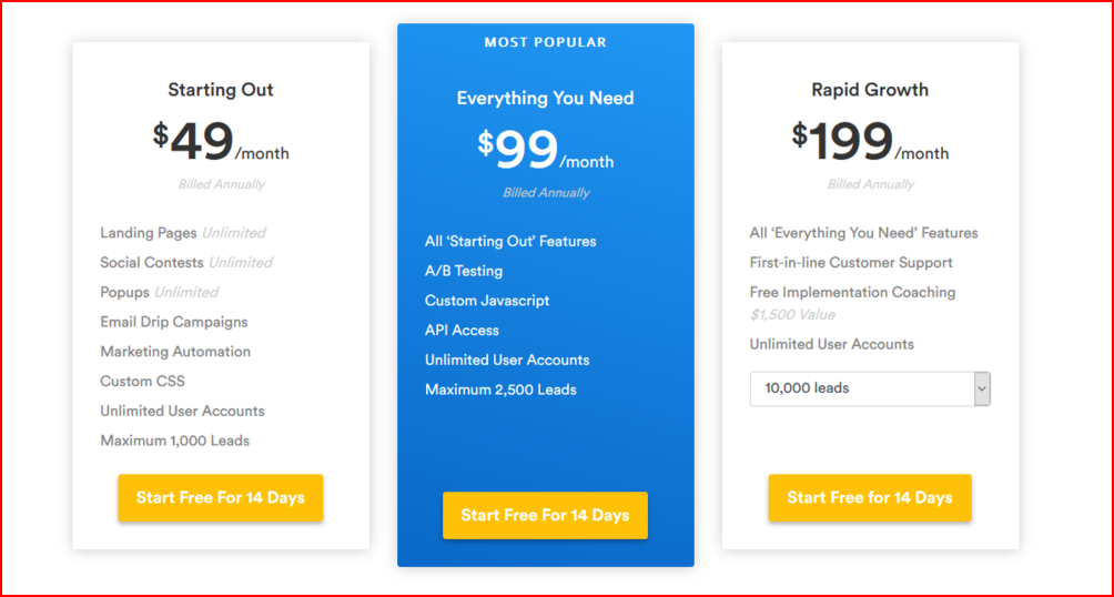
You can take it one step further by introducing the bandwagon effect as seen on Wishpond’s landing page. Through the visual cue – blue highlight and the mention of “most popular”- they subtly prompt users to choose an option they want them to. People subconsciously conform to the request and become paying members.
7. Conversion Scent
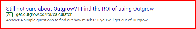
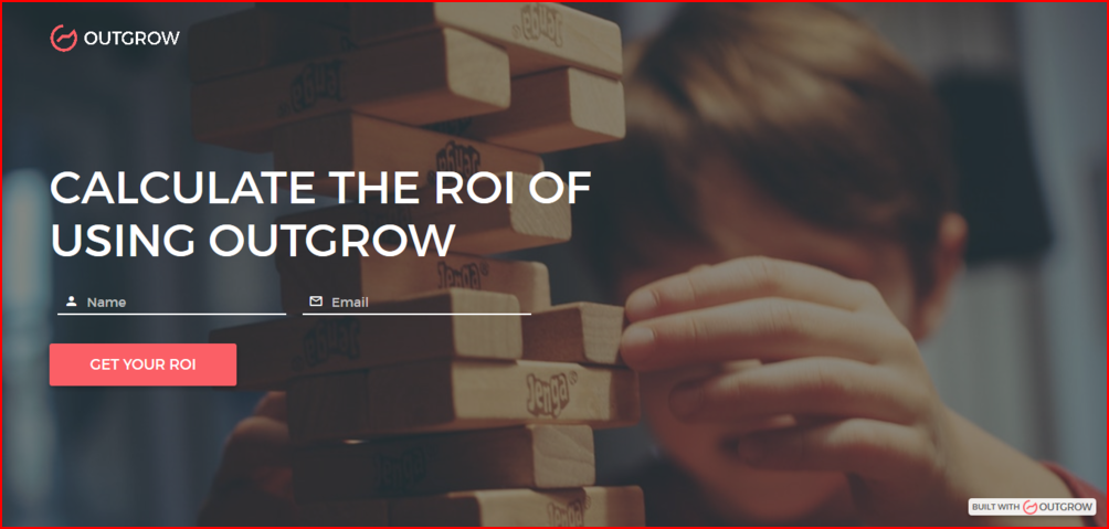
You are running paid ads, and getting traffic on your landing page but can’t seem to understand why your marketing funnel is still empty. Perhaps, there is a lack of cohesion between the source and the landing page content. For example, if your ad promises a 20% discount on a BnB but your landing page has no mention of it whatsoever, then that’s the root of all your problems. To gather more leads pay close attention to conversion scent. Do away with your one-page-fits-all approach for every offer and instead create unique landing pages for various offers. Moreover, keep in mind design cohesiveness because of the more similar the two look, the higher the conversion rate.
Consider one of our ads and the corresponding landing page. We keep the conversion scent intact by delivering what the ad promises i.e. the ROI of using Outgrow.
Do you now understand how applying a few psychological principles can actually help you collect more leads in your marketing funnel? Excellent! But don’t swallow our advice in its entirety! A/B test your landing pages and let the data determine which copy to keep. You will be surprised to know how simple tweaks can be so effective in improving landing page conversions.
The better you design your landing page the more conversions you’ll get. However, there is more than one way to generate leads for your business, read our guide on interactive lead-generation techniques to find out.


One Comment