
Summarize with :
How Colors Affect Conversions- Examples & Applications
Table of Contents
Audiences online have limited attention spans. They’re powering through websites (and digesting information at 1,000,000 miles an hour). The sole means to grab their attention is to stand out among all the chaos. That’s where color comes in. This especially works in today’s world as companies seek to use this type of psychology to bring in more customers. So in this guide, we will talk about how colors affect conversions and help boost your business.
Summary
When colors are being chosen by a company for their website, a number of factors are considered by the marketers and designers. These factors can be anything ranging from culture to the person’s perspective and preferences.
Some Facts About Colors and Products
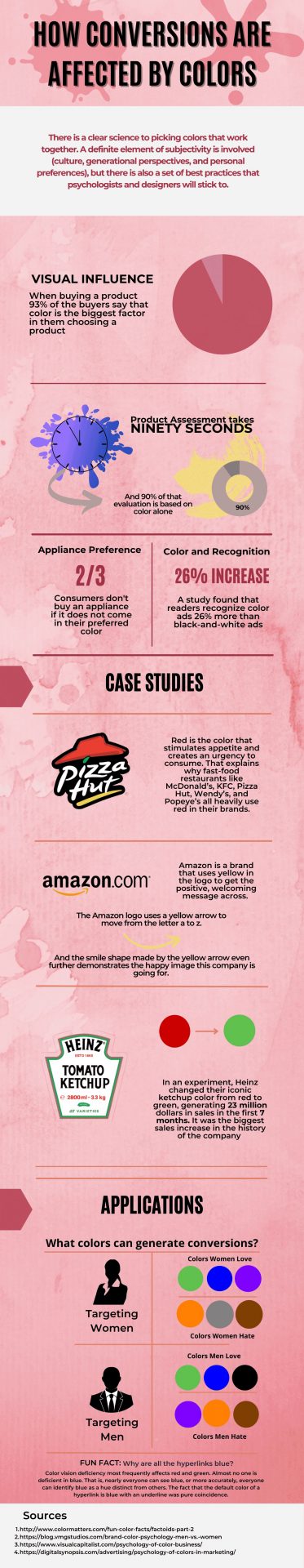
- According to some surveys, when people buy a product, 93% of them say that color is the biggest factor for them to choose a product.
- It takes only 90 seconds to do a product assessment and 90% of that evaluation is based on color alone.
- Using a reliable resource to find color codes can help maintain consistency across product design and marketing materials.
- Two-thirds of the customers do not buy a needed appliance if it is not available in the color that they want.
- A study found that people who read magazines recognize color ads 26% more than they recognize black and white ads.
PRO TIP-
If you want users to come to your website and increase your click-through rate and on-site time, you need to create colorful and interactive content that keeps your users engaged. Sign up with Outgrow’s 7-day free trial and create interactive content pieces using the colors of your choice.
Case Studies
Here are some case studies that define how colors affect conversions-
1. Pizza Hut
Now we all know that Pizza Hut is one of the best places to get a pizza, because as soon as we see the logo or the outlet for this brand we start to feel hungry and happy. But do you know why? Because the color red is said to stimulate appetite and the urgency to consume, whereas the color yellow stimulates happiness and warmth.
2. Amazon.com
The logo of Amazon.com contains a yellow curving arrow. Now as in the case of the example of Pizza Hut, yellow stood from warmth and happiness. Here the arrow that moves from a to z, contains multiple meanings. The first one is obvious, that it contains every product from a to z. And the second one is a smile that shows the happy image that the company is going for.
3. Heinz Tomato Ketchup
So Heinz did a little experiment where they changed the color of their sauce from red to green, and believe it or not, it sold out like crazy. About 7 million units were sold and 23 million dollars were made in revenue. Because they changed from red to green, people thought that the sauce was much healthier and that is why it sold like crazy.
Now Outgrow can’t do anything crazy like Heinz, but we can help you out by asking about your project and color preferences and creating an engaging interactive piece of content with the colors you choose. This is not the best part though.
The best part is that you can also check out the wide range of premade templates available and customize them as per your branding guidelines!
Applications
Let’s look at a few applications of how colors affect conversions and the psychology of people. In other words, let’s see what colors you can use on your website to target the audience.
1. If you Want to Target Women
There are three main colors that women love which are green, blue and purple and three that they absolutely hate which are: orange, gray and brown. If you want to target women specifically, we would recommend using the colors they love and avoiding those that they do not prefer.
2. If it’s Men That Need Targeting
Three colors that the men love are green, blue, and black and the three that they abhor are usually purple, orange, and brown. So if you want to target men specifically, you might want to stay away from the purple, orange, and brown colors on your website.
Conclusion
Highly colorful quizzes are not the answer, but the careful selection of colors according to the target market is what you need.
A correct choice of colors is just as important as catchy headlines, trendy keywords, and interactive content pieces. So if you want to improve your on-site time and click-through rate, you will have to use proper colors along with the right content to bring in more users.
Now if you are determined to improve your website’s on-site time, try out Outgrow’s interactive content builder and create the most amazing and engaging content pieces with the most elegant color schemes. Sign up for their free trial here.