Summarize with :
9 Hacks to Create an Exit Intent Popup for More Leads
Table of Contents
Here’s an interesting story: We conducted a poll in our office. Our aim was to understand the importance of optimizing the exit intent popup. We started by asking one question to all the participants.
“What’s worse than someone leaving you when you want them to stay?”
Exactly 97.64% of them replied along the lines of this answer:
“Realizing that they would have given you money if they stayed.”
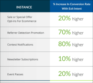
Okay, maybe this statistic was based on largely unscientific methods. Here’s another one that might help our cause:
Now that you have conclusive proof about the converting power of that exit popups, let’s get on with our search to find out what will make your lead generation game pop (get it?)
Here are 10 powerful solutions that can help you accelerate conversion rates using an exit intent popup.
1) Design
Design won’t save the world, but it damn sure will make it look good. The same goes for the exit intent popup. Make your pop-up look so good that the visitor is forced to stay with you. The design of the pop-up must be in sync with the rest of the website – its color, font, and design. Meanwhile, it is equally important to understand the difference between ‘enticing’ and ‘flashy’. Don’t want your customers to detract from the message you want to convey, right?
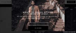
Take a look at this pop-up by Five Four Club. The design of the pop-up is of the same color and font as the website. And of course, it’s got the square pop-up design going for it. After all, 80% of the pop-ups that convert are square-shaped. The clear and precise CTA coupled with an attractive background? You have got yourself a lead! Any good popup software has a lot of customization options, so you should be able to create different popup designs that fit your website.
2) Employ Humour and Wit
Now that we have covered how the pop-up is going to look, let’s discuss what it is going to say. It is believed that people remember the ads that make them laugh and influence further buying practices. If someone decides to leave your website without engaging, lure them in by making them laugh. Take a look at this article by Cloudnames to understand just why pop-ups may lead to lots of LOLs- a lot of leads, of course.
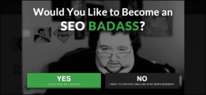
Take a look at this humorous pop-up by Jacob King for an SEO course. Even though this pop-up is not particularly attractive, it arrests the viewers with its catchy content. You have to pay special emphasis on the fact that your pop-up should not be averse to your brand’s tone of voice just for the sake of humor.
3) Offering Giveaways and Discounts
When does anyone ever refuse a free treat? Sometimes, customers are not ready to commit to your product/services. What do you do in such a situation? Give them a taste of it for free! Offer discounts, giveaways, free trials, etc. to the customers through the exit intent popup.
When it comes to offering discounts through exit intent pop-ups, nobody does it better than the Coutouring Online Store. The no-fuss design of the pop-up conveys the precise value of the offer. One thing’s for sure: This one’s definitely a show-stopper.
4) Segmenting
Arthur Schopenhauer once said ‘Talent hits a target no one else can hit; genius hits a target no one else can see’. This seemingly unrelated quote can teach us a lot about segmenting the exit intent popup. Non-segmented pop-ups can not only make you miss out on lead opportunities but also provide a bad user experience. The pop-up must be related to what the customer was browsing on your website. For instance, if someone is browsing through the women’s apparel section of your e-commerce website, do not showcase a pop-up featuring men’s apparel. Don’t make a shot in the dark, you might just kill a prospect.
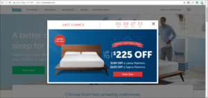
This exit intent popup by Leesa is a work of art. The pop-up offers a discount on the specific mattress that is searched for by the customer. Furthermore, the countdown timer creates a sense of urgency, adding the finishing touch to the masterpiece.
5) Personalization
This tip can be easily confused with segmentation. Since we started that topic with a defining quote, it’s only fair we do the same here. This quote by Saul Alinsky will help you differentiate between the two: “Pick the target, freeze it, personalize it, and polarize it.” You have already picked the target, now it’s time to personalize it. Mold the content of the pop-up in a way that seems personal to the customer. Incorporate personal pronouns to speak directly to the user and make your pop-up sound conversational.
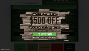
Triad Landscaping does personalization, right? The use of pronouns coupled with an attractive design is totally worth the stay on the website. The most noteworthy aspect of this pop-up is the emphasis given to the button asking the customer to stay. Meanwhile, the ‘no, thanks’ button is colorless and seems like the less preferred option here. If the choice is clean, so will the prospect’s decision to stay with you.
6) Use Interactive Experience
Interactive experiences have been proven to enhance conversion rates by 40-50%. They allow the visitors to be an active participant in your website. This is a great tactic to make the customer stay with you. On average, the conversion rates increased by 161% across all industries with user-generated content. So, social proof is a game-changer that businesses should utilize. Marketers think interactive content grabs readers’ attention and gives an opportunity to gather prospects. Now that’s killing two birds with one stone.
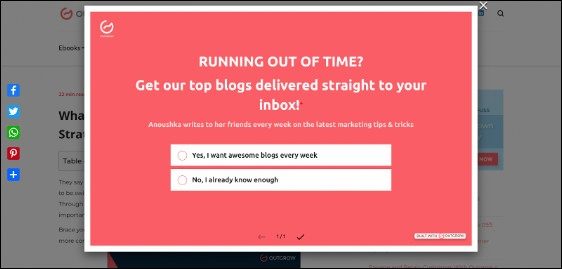
For example, take a look at how we added a quiz as an exit intent popup on our blog.
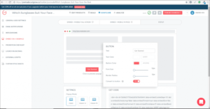
Did You Know: You have the option of embedding Outgrow quizzes and calculators in the exit intent popup on your website. For instance, you run an e-commerce company that sells sunglasses. How great would it be to have a quiz like this embedded in your pop-up?
7) Optimize for Mobile
Chances are that half of your website visitors are browsing it on their phones.
In the second quarter of 2022, mobile devices (excluding tablets) generated 58.99% of global website traffic, consistently hovering around the 50% mark since the beginning of 2017 before permanently surpassing it in 2020.
If you do not optimize your exit intent popup, equal chances are you will miss out on those leads. You can use the same pop-up for computers and mobile screens. However, the CTA and text have to be optimally placed. You will be surprised how these little efforts make for a far higher engagement rate.
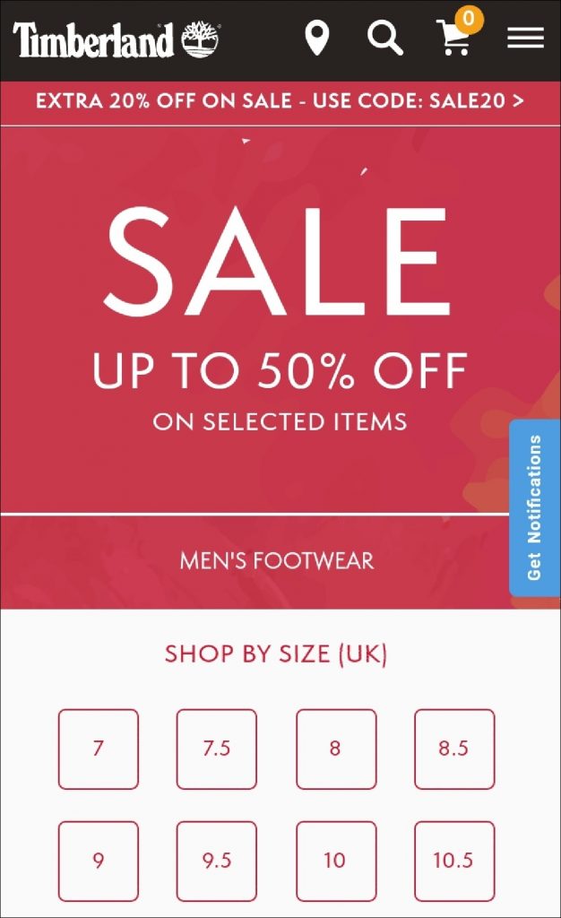
If you’re looking for clues, here is an excellent example from Timberland. This full-screen exit intent popup is optimized efficiently for mobile. They offer a sale on their articles through a coupon and personalize the pop-up on the basis of the products the visitor was browsing through.
8) Offer Resources
Offering something valuable to the consumers will never disappoint them. Or you, for that matter. You can employ useful resources to convince visitors you are worthy of their time. The best way to do this would be to offer resources like checklists, ebooks, and templates to redirect them to the pages that will bring you more sales. Additionally, you can use these resources to gain prospects.
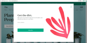
Just take a look at this exit intent popup by The Sill. They provide tips on taking care of new plants through this minimalistically designed pop-up. This is a classic example of business specific resource as well as a lead-generation tactic. And who could ever miss the punny headline: “Get the dirt.”
9) Recommendation
Product recommendation is not really a new move in the market, but using it as a tactic for making consumers stay? That’s genius! Here are two statistics to better prove our point:
1) 54% of retailers claimed that product recommendations act as the key driver of the AOV (average order value) in customer purchases.
2) Research from Salesforce shows that shoppers that clicked on recommendations are 4.5x more likely to add these items to their cart and complete the purchase.
These stats point towards one thing only: If a customer is interested in your product, recommendation exit pop-ups are a sure way to make them stay and buy from you.
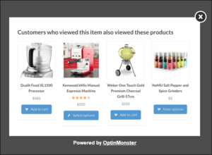
Take a look at this exit pop-up template by Optimonk:
This template showcases the products related to the one searched by the viewer and might interest them further. You can display products that sell most in that category or new additions to it.
What are you waiting for? Bring out those big guns with ‘You may also like’ pop-ups!
As We Bid Farewell…
We have just spilled the tea on the best ways to optimize your exit intent popup. What’s better than having convinced a person to stay?
Knowing they will pay to stay with you.



One Comment