Pricing Comparison Calculator Examples: 12 Pages That Help Buyers Switch
Introduction: Pricing Calculator vs Comparison Calculator vs Quote Calculator
Table of Contents
Buyers rarely convert the moment they land on a pricing page. Customers hesitate. Tabs switch between competitors. Mental math starts but never quite finishes. Pricing calculators and Pricing Comparison Calculator Examples exist to close that gap and replace uncertainty with a number the buyer can trust.
But not all pricing calculators work the same way. The term is used loosely to describe at least three distinct tools, each serving a different job in the buying process. Confusing them leads to tools that collect leads but don’t accelerate decisions.
What Is a Pricing Calculator?
A pricing calculator estimates what a buyer will pay based on how they plan to use a product. It takes inputs like number of seats, monthly message volume, data storage, and API calls, then returns an estimated cost. The goal is transparency: let the buyer self-qualify before they ever speak to sales.
Pricing calculators are most common in usage-based or seat-based SaaS models, where the final cost genuinely depends on how much or how broadly a product is used. AWS, Snowflake, and Twilio all offer pricing calculators because their billing is too complex to summarize on a static page.
What Is a Comparison Calculator?
A comparison calculator goes a step further. Rather than showing a single estimated cost, it places two or more options side by side, either different tiers of the same product or the buyer’s current solution versus the one being pitched.
Comparison calculators answer the question every mid-funnel buyer is actually asking: Is switching worth it? They make the delta visible. Instead of asking the buyer to do mental math across two browser tabs, a comparison calculator surfaces the savings, the feature gaps, or the cost per outcome in a single view.
HubSpot’s plan comparison tool and Asana’s savings calculator against Monday.com are both comparison calculators. The inputs may look similar to a pricing calculator, but the output is relational. It’s about the gap, not the absolute number.
What Is a Quote Calculator?
A quote calculator is the most transactional of the three. It collects enough detail to generate something close to a real quote, often triggering a CRM workflow, a sales notification, or a personalized PDF that gets emailed to the buyer.
Quote calculators are common in B2B services, insurance, and custom software. They don’t just estimate; they initiate a commercial process. The output often includes line items, a scope summary, and a CTA to book a call or accept the quote.
Pricing Calculator vs Comparison Calculator vs Quote Calculator
| Type | Primary Goal | Output | Funnel Stage |
| Pricing Calculator | Estimate cost of use | A number or cost range | Awareness to Consideration |
| Comparison Calculator | Quantify switching value | A side-by-side delta | Consideration to Decision |
| Quote Calculator | Initiate a commercial conversation | A personalized quote or proposal | Decision to Close |
The distinction matters because each tool requires different inputs, different outputs, and different placement on your site. A pricing calculator on a competitor comparison page will underperform. A comparison calculator embedded in an awareness blog post will confuse readers who haven’t started evaluating yet.
Why Interactive Pricing Experiences Convert Better
Static pricing pages put the cognitive burden on the buyer. A table of tiers with feature checkmarks forces visitors to self-interpret, extrapolate, and mentally map their situation onto rows and columns that weren’t built for them.
Interactive calculators flip the dynamic. The buyer inputs their reality, including team size, usage volume, and current spend, and receives a result that feels personal. Research consistently shows that interactive content drives 2x the engagement of static content. In the context of pricing, that engagement translates directly to intent signals. A buyer who has spent 90 seconds with your calculator is far more committed to evaluating you seriously than one who skimmed a pricing page.
The 12 examples below illustrate how companies across SaaS, cloud infrastructure, healthcare, and productivity use pricing calculators to accelerate exactly this kind of decision.
Quick Matrix: 12 Pricing Comparison Calculator Examples
Comparison Table Overview
| Company | Compare Against | Pricing Model | Key Inputs | Output Style | Funnel Position |
| Twilio | Self (usage tiers) | Usage-based | Message volume, channel, region | Cost estimate | Mid-funnel |
| Snowflake | Self (consumption tiers) | Consumption-based | Workload type, compute usage | Cost range | Mid-funnel |
| AWS | Competitors and self | Usage-based | Services, regions, instance types | Detailed cost report | Mid-funnel |
| Zoom | Self (seat tiers) | Per-seat | Team size, feature needs | Monthly/annual estimate | Mid-funnel |
| Microsoft Azure | Competitors and self | Per-seat/consumption | Workload, region, scale | Cost breakdown | Mid-funnel |
| Creative Widgets | Self | Per-seat/project | Team size, project type | Tier recommendation | Top-funnel |
| HubSpot | Self (plan tiers) | Per-seat and usage | Contacts, team size, features | Plan recommendation | Decision |
| Triage Cancer | Insurance options | Plan-based | Coverage needs, expected usage | Side-by-side comparison | Decision |
| HSA Bank | Plan options | Plan-based | Medical spend, HSA contributions | Annual savings estimate | Decision |
| Asana | Monday.com | Per-seat | Team size, current plan | Annual savings | Decision |
| Notion | Confluence | Per-seat | Team size, current plan | Cost/feature comparison | Decision |
| Outgrow | Typeform | Per-seat and ROI | Team size, lead volume, goals | ROI and feature delta | Decision |
Usage-Based Pricing Calculators
Usage-based pricing creates an inherent transparency problem. Buyers want to understand what they’ll pay, but the answer genuinely depends on how they use the product. Static pricing pages either oversimplify and frustrate power users, or overwhelm and lose casual buyers. A usage-based pricing calculator resolves this by letting each visitor input their actual usage profile and receiving an estimate tuned to them.
Twilio Pricing Estimator
What It Does
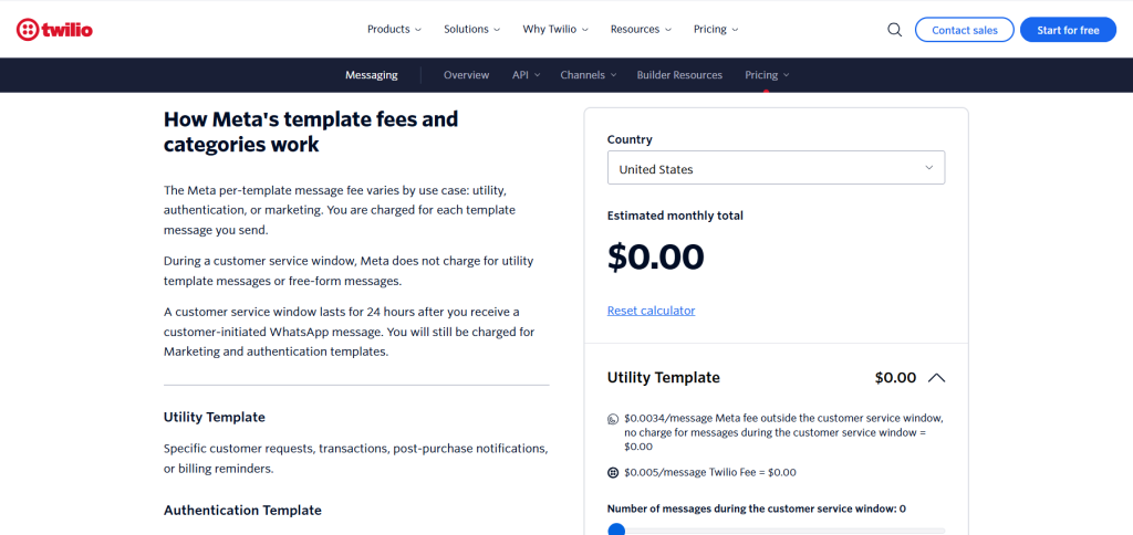
Twilio’s WhatsApp pricing estimator helps businesses understand the cost of running WhatsApp-based customer communications before they commit to the API. Twilio charges per conversation, with rates varying by conversation type (marketing, utility, authentication, service) and by the recipient’s country. The estimator translates that complexity into a monthly cost estimate based on how many messages a business expects to send and receive.
Key Inputs
- Monthly message or conversation volume
- Conversation category (marketing, utility, authentication, service)
- Target country or region
Output Format
A monthly cost estimate broken down by conversation type, making it easy for businesses to see which category drives the most spend and whether it aligns with the ROI they expect from each conversation type.
Funnel Placement
The estimator lives on the WhatsApp pricing page, intercepting buyers who have already decided that WhatsApp is the right channel but are comparing Twilio against direct API access or other CPaaS providers. It’s a mid-funnel tool designed to move buyers from consideration to decision.
What Makes It Convert
The breakdown by conversation category gives buyers a planning artifact, not just a number. A business can look at the output and immediately understand that their marketing messages cost four times what utility messages cost, then use that to restructure their communication strategy before they even sign up. That level of actionable insight creates commitment.
Snowflake Consumption Calculator
What It Does
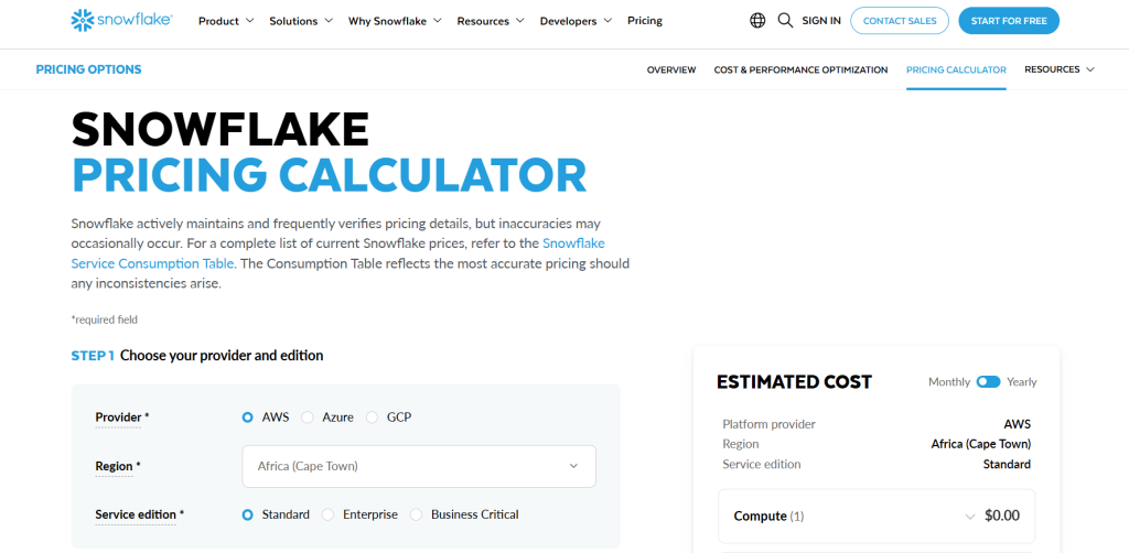
Snowflake’s pricing calculator helps data teams estimate the cost of running workloads on its platform before they provision any resources. Because Snowflake charges based on compute credits consumed rather than just storage or seats, the cost surface is genuinely complex. The calculator takes workload type and scale as inputs and returns an estimated monthly cost in dollars.
Key Inputs
- Cloud provider (AWS, Azure, Google Cloud)
- Region
- Workload type (ETL, analytics, data sharing)
- Estimated data volume and query frequency
Output Format
An estimated monthly cost with a breakdown by compute and storage, giving data engineers a baseline for budget conversations with finance teams.
Funnel Placement
Snowflake’s calculator sits on the pricing page alongside plan comparison information. It targets technical evaluators including data engineers and analytics leads who need a concrete number to bring to procurement. It’s a mid-funnel tool that bridges technical evaluation and commercial approval.
What Makes It Convert
Snowflake’s calculator reduces the perceived risk of a platform that charges by consumption. The fear with consumption-based pricing is always bill shock. By making the estimate concrete upfront, Snowflake pre-empts that fear and positions the calculator itself as evidence of pricing transparency. Buyers who use the calculator are more likely to trust Snowflake’s billing practices than those who don’t.
AWS Cost Comparison Calculator
What It Does
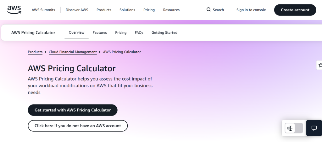
The AWS Pricing Calculator is one of the most comprehensive pricing tools in enterprise software. It allows users to build detailed cost estimates across hundreds of AWS services including compute, storage, database, networking, and machine learning, and compare costs across regions, instance types, and commitment levels.
Key Inputs
- AWS services to include in estimate
- Region
- Instance type and size
- Usage hours per month
- Commitment level (on-demand, 1-year, 3-year reserved)
Output Format
A full cost report with line-item breakdowns, exportable as a PDF or shareable via a unique URL. The output is detailed enough to be used in formal business cases and procurement workflows.
Funnel Placement
The AWS calculator functions at multiple funnel stages simultaneously. New evaluators use it for rough estimates. Existing customers use it to optimize spend. Enterprises use it to model migration scenarios. Its placement at the intersection of pricing transparency and sales engineering makes it one of the most versatile calculator deployments in the industry.
What Makes It Convert
The shareable URL is the key conversion mechanic. When a technical evaluator builds a cost model in AWS’s calculator, they can share it directly with a manager or finance lead, turning a tool built for individual use into a collaborative artifact that moves the deal forward. The ability to export and share creates natural follow-up moments.
Seat-Based Pricing Calculators
Seat-based pricing is conceptually simpler than usage-based pricing. You pay per user, per month. But simple doesn’t mean frictionless. Buyers still need to model plan differences, annual vs. monthly billing, add-ons, and discounts at scale. Seat-based calculators reduce that friction by giving buyers a live estimate that updates as they adjust team size and features.
Zoom Pricing Calculator
What It Does
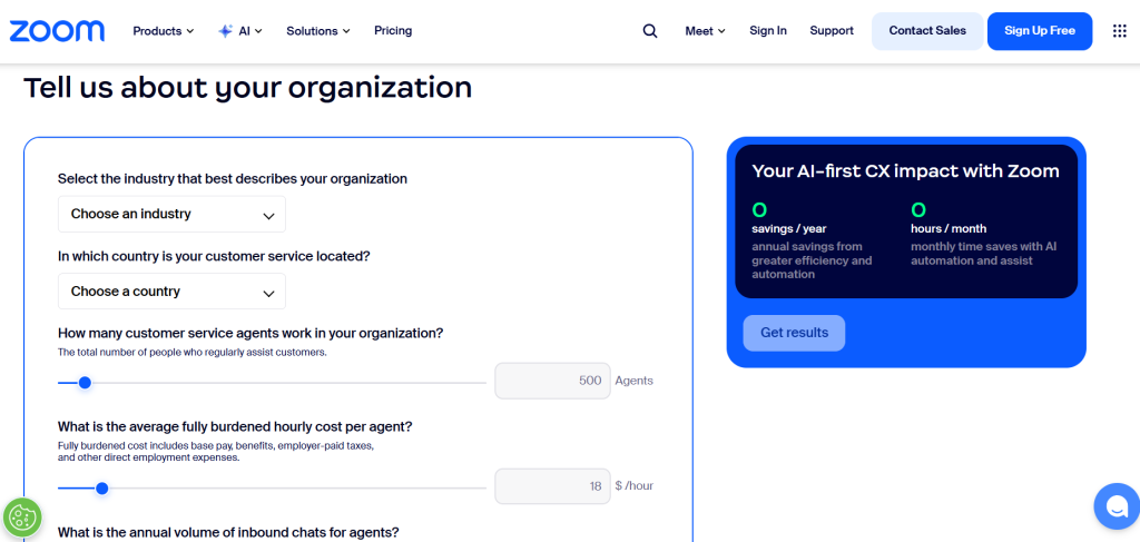
Zoom’s contact center and CX pricing calculator helps businesses estimate the cost of deploying Zoom’s customer experience platform for their support or sales teams. It maps team configuration to a monthly cost, factoring in the number of agents, the features required, and whether the deployment is inbound-only or blended.
Key Inputs
- Number of agents
- Channels required (voice, digital, or both)
- Feature tier (essentials, plus, premium)
- Billing frequency (monthly vs. annual)
Output Format
An estimated monthly total with a per-seat breakdown, plus a side-by-side comparison of what’s included at each tier for the team size entered. The annual savings versus monthly billing is highlighted prominently.
Funnel Placement
Placed on the CX-specific pricing page, targeting IT decision-makers and contact center managers who are evaluating Zoom against established CX platforms. It’s a decision-stage tool designed to reduce the time between evaluation and procurement.
What Makes It Convert
The annual vs. monthly billing comparison is prominently displayed, making the savings from committing annually feel immediate and tangible. For a 50-agent team, that savings figure can run into the thousands. Seeing it as a concrete number rather than a percentage makes the commitment feel obvious rather than risky.
Microsoft Azure Pricing Calculator
What It Does
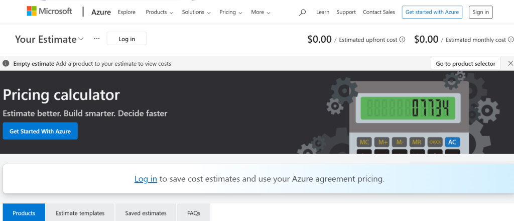
Azure’s pricing calculator allows IT teams and architects to estimate the cost of running workloads on Microsoft’s cloud platform. It covers a vast surface area including compute, database, AI services, and networking, but its particular strength is helping organizations model the cost of migrating existing Microsoft workloads like SQL Server and SharePoint to the cloud.
Key Inputs
- Azure services and configurations
- Region
- Operating system and license type
- Compute tier and scale
- Azure Hybrid Benefit (if applicable)
Output Format
A detailed cost estimate with service-level breakdowns, support tier costs, and an optional comparison against on-premises infrastructure costs. The Azure Hybrid Benefit calculator shows organizations running existing Microsoft licenses exactly how much they’d save by bringing those licenses to Azure.
Funnel Placement
Azure’s calculator serves both acquisition for net-new cloud buyers and expansion for existing Microsoft customers evaluating cloud migration. It’s embedded in both the pricing section and the migration resource center, making it a versatile mid-to-late-funnel tool.
What Makes It Convert
The Azure Hybrid Benefit integration is a powerful conversion mechanic for the Microsoft installed base. Organizations that already own SQL Server or Windows Server licenses can immediately see a concrete savings figure, often 40% or more, simply by toggling a single checkbox. That specificity turns an abstract migration conversation into a quantified financial decision.
Creative Widgets Team Pricing Calculator
What It Does
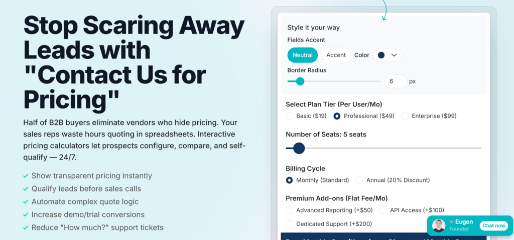
Creative Widgets offers a customizable pricing calculator template built for agencies and SaaS companies that want to embed an interactive pricing experience on their own website. The tool itself is a meta-example: it demonstrates the value of pricing calculators by being one.
Key Inputs
- Team size
- Project type or use case
- Feature requirements
- Billing preference
Output Format
A recommended plan with a monthly and annual cost estimate, surfaced as a visual card with a highlighted recommended tier. This reduces decision fatigue by pointing buyers toward the best fit rather than listing all options neutrally.
Funnel Placement
Creative Widgets’ calculator template is positioned as a lead generation and conversion tool for product and marketing teams. It sits at the top of the funnel for buyers learning what a pricing calculator can do, and at the decision stage for their end customers.
What Makes It Convert
The recommended plan mechanic is the key design choice. Rather than displaying all options and asking the buyer to choose, the calculator does the selection work, surfacing a “recommended for you” badge on the most appropriate plan. This reduces choice paralysis and increases click-through to the plan CTA.
Tiered Plan Comparison Calculators
Tiered pricing creates a specific decision problem: buyers need to understand not just which plan they can afford, but which plan fits how they actually work. Feature lists help, but they put the cognitive burden on the buyer to map abstract features to real workflows. Tiered plan comparison calculators replace that mapping exercise with a direct recommendation based on the buyer’s specific situation.
HubSpot Plan Comparison Tool
What It Does
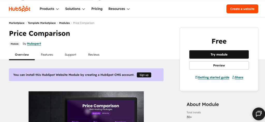
HubSpot’s plan comparison module allows buyers to input their current usage profile including number of contacts, marketing seats, sales seats, and service desk volume, then receive a side-by-side comparison of what each HubSpot Hub and tier would cost, including the bundle pricing savings available through the Customer Platform.
Key Inputs
- Number of marketing contacts
- Number of sales seats
- Number of service seats
- Current tools in stack for switching cost context
Output Format
A side-by-side cost comparison across Starter, Professional, and Enterprise tiers for each Hub, with a bundled Customer Platform estimate. The output highlights where a buyer is currently over-buying or under-buying relative to their stated needs.
Funnel Placement
The tool is embedded in HubSpot’s pricing ecosystem and is primarily used by buyers who have already decided to evaluate HubSpot but need help navigating its modular pricing structure. It targets the late consideration and decision stages.
What Makes It Convert
HubSpot’s pricing is genuinely complex. A buyer trying to construct the right bundle manually can spend 30 minutes reading documentation and still feel uncertain. The calculator collapses that uncertainty into a clear recommendation in under two minutes. The relief of that clarity is itself a conversion signal.
Triage Cancer Plan Comparison Calculator
What It Does
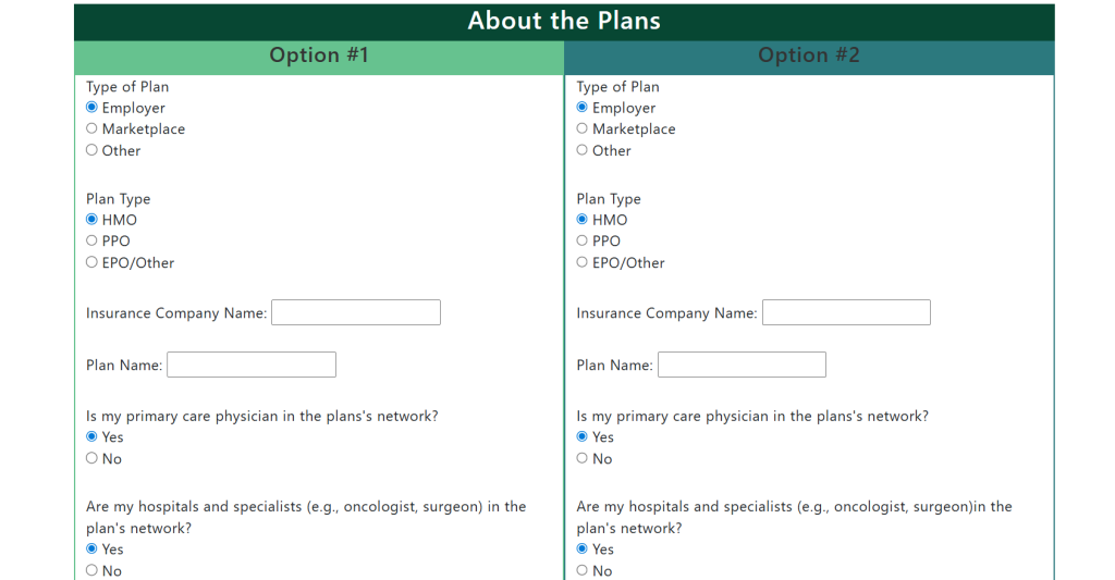
Triage Cancer’s health insurance plan comparison worksheet helps people diagnosed with cancer evaluate their health insurance options at open enrollment. It helps users compare the total annual cost including premiums plus expected out-of-pocket expenses across different insurance plans given their anticipated medical needs.
Key Inputs
- Monthly premium for each plan under consideration
- Expected number of doctor visits, specialist visits, and procedures
- Prescription medication costs
- Deductible and out-of-pocket maximum for each plan
Output Format
A total annual cost estimate for each plan, side by side, making the lowest-cost option visible even when the plan with the lowest premium isn’t the most cost-effective for a high-utilization patient.
Funnel Placement
This calculator lives in Triage Cancer’s quick guides section and reaches users at the highest-stakes moment in their healthcare planning. Its placement and purpose make it one of the most instructive examples in this list for any company selling to buyers who feel overwhelmed by complexity.
What Makes It Convert
The worksheet format builds trust through transparency. There’s no agenda pushing the user toward a particular plan. The tool simply surfaces the math. For commercial comparison calculators, this is a powerful lesson: the most converting calculators often feel the least like they’re selling.
HSA Bank Plan Recommendation Calculator

What It Does
HSA Bank’s health plan comparison calculator helps users decide between a traditional health plan and a High Deductible Health Plan paired with an HSA. It quantifies the potential tax savings and net cost difference, making the case for the HDHP/HSA combination in concrete dollar terms.
Key Inputs
- Annual income to estimate tax bracket
- Expected annual medical expenses
- Current and proposed premium costs
- Employer HSA contribution if applicable
Output Format
An estimated annual net cost for each plan option, with a dedicated line item showing the tax savings generated by contributing to an HSA. The output clearly surfaces whether switching to an HDHP/HSA would save or cost money given the user’s specific situation.
Funnel Placement
The calculator lives in HSA Bank’s Learning Center, targeting buyers at the awareness and consideration stage before they’ve committed to opening an HSA account. It’s a top-of-funnel calculator that qualifies intent: a user who sees significant tax savings has effectively self-qualified as an HSA prospect.
What Makes It Convert
The tax savings line item is the conversion anchor. Abstract concepts like “triple tax advantage” are hard to internalize. Seeing a concrete figure like $847 in tax savings per year makes the benefit real and creates a clear, emotionally legible reason to take action.
Competitive Switch Calculators
Competitive switch calculators are the most explicitly persuasive tool in the pricing calculator category. They exist not to estimate cost in a vacuum, but to make the case that switching from one platform to another is financially justified. Done well, they’re honest comparisons that happen to favor the company that built them. Done poorly, they damage trust.
Monday.com vs Asana Savings Calculator
What It Does
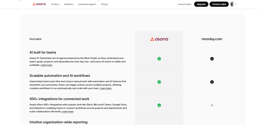
Asana’s comparison page against Monday.com includes a savings calculator that lets users input their team size and current Monday.com plan to see their estimated annual savings if they switched to Asana. It’s a direct, late-funnel tool targeting buyers who are actively evaluating both platforms.
Key Inputs
- Team size (number of seats)
- Current Monday.com plan (Basic, Standard, Pro, Enterprise)
- Billing frequency (monthly vs. annual)
Output Format
An estimated annual savings figure alongside a feature comparison table that contextualizes the cost delta with capability differences. The savings figure is prominently displayed above the feature comparison, ensuring the financial case is made before the feature case.
Funnel Placement
This calculator lives on Asana’s dedicated Monday.com comparison page, capturing high-intent search traffic from queries like “Asana vs Monday.com pricing.” It targets buyers who have already shortlisted both platforms and need a decision-making nudge.
What Makes It Convert
The specificity of inputs makes the output feel credible. A calculator that asks for your exact current plan and returns a precise savings figure is far more persuasive than a generic “save up to X%” claim. A buyer who enters 50 seats and sees a $12,000 annual savings figure now has a concrete financial case to bring to their manager.
Notion vs Confluence Comparison Calculator
What It Does
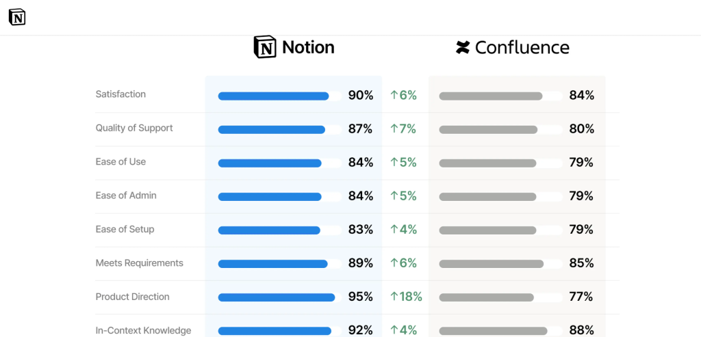
Notion’s comparison page against Confluence presents a side-by-side pricing and feature comparison with an interactive cost estimator. It lets users model the cost difference between Notion and Confluence for their specific team size, while also surfacing qualitative differentiators like setup time, page limits, and integrations.
Key Inputs
- Team size
- Current Confluence plan (Standard, Premium, Enterprise)
- Whether the team uses additional Atlassian products like Jira
Output Format
A cost comparison table with estimated annual totals for both platforms, accompanied by a qualitative scorecard covering ease of use, migration effort, and total cost of ownership. The cost comparison and feature scorecard are integrated so the buyer sees both financial and non-financial switching costs in the same view.
Funnel Placement
Like Asana’s calculator, Notion’s comparison tool lives on a dedicated competitor comparison page. It captures buyers who are actively dissatisfied with Confluence, often Atlassian customers who’ve experienced a price increase or a product change, and converts their frustration into a concrete switching evaluation.
What Makes It Convert
The inclusion of migration effort as a factor is strategically smart. Switching costs are the primary reason buyers don’t switch even when they want to. By proactively addressing migration and framing it as manageable, Notion removes the biggest psychological barrier to conversion. The calculator doesn’t just show that Notion is cheaper; it shows that it’s cheaper and not that hard to get to.
Outgrow vs Typeform ROI Calculator
What It Does
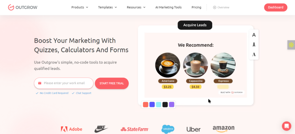
Outgrow’s comparison against Typeform takes the competitive switch calculator format one step further by calculating not just cost savings but revenue impact. The calculator asks buyers about their lead generation goals and current form performance, then models what switching from Typeform to Outgrow would mean in terms of leads generated and pipeline created.
Key Inputs
- Monthly website traffic
- Current form completion rate
- Average lead value
- Team size and current Typeform plan
Output Format
An estimated annual ROI from switching, combining cost savings from lower platform spend with revenue upside from higher conversion rates through interactive content. The output is presented as a net financial impact, not just a pricing comparison.
Funnel Placement
This calculator is embedded within a blog post and comparison landing page, targeting buyers at the consideration stage who are evaluating interactive content platforms. Because it leads with ROI rather than cost, it speaks to a broader audience including buyers who aren’t currently on Typeform but are evaluating whether interactive content is worth the investment.
What Makes It Convert
The ROI framing transforms the calculator from a defensive cost comparison into an offensive growth case. A buyer isn’t switching from Typeform to save money. They’re switching to make more money. That reframe elevates the conversation from budget negotiation to business impact, which is a far more compelling reason to act and a far easier internal sell.
How to Build a Pricing Comparison Calculator Without Exposing Sensitive Pricing Logic
Building a pricing calculator that’s useful enough to convert without revealing internal cost structures or creating contractual problems requires deliberate design choices. Here’s how leading teams navigate that tension.
Use Pricing Ranges Instead of Exact Formulas
The most common mistake in pricing calculator development is attempting to replicate the exact billing logic in the front end. This creates two problems: it exposes the formula to competitors who can reverse-engineer it, and it sets pricing expectations that sales reps may need to override.
The better approach is to use ranges. If a 50-seat team at the Professional tier costs between $2,400 and $3,600 annually depending on add-ons and negotiation, the calculator should display “starting from $2,400/year” or “estimated $2,400 to $3,600/year.” This is accurate, honest, and defensible without hard-coding a number that creates downstream friction.
Gate Advanced Outputs Behind Lead Capture
Not every output needs to be fully visible before a buyer identifies themselves. A well-designed gate puts a basic estimate in front of the wall and a detailed breakdown behind it. The buyer can see that switching saves money before they give their email; they need to share their email to see the full per-feature savings breakdown, the customized migration timeline, or the downloadable PDF.
This approach both generates leads and increases the perceived value of the detailed output. Buyers who opt in to see more have demonstrated intent, making them higher-quality leads than those who bounce from a pricing page.
Use Weighted Recommendation Models
For tiered comparison calculators, a weighted recommendation model, where the calculator scores each tier against the buyer’s inputs and surfaces the best match, is more defensible than a purely algorithmic cost calculation. The weighting is a business decision, not a price reveal. You can tune it to recommend the tier that’s genuinely best for the buyer’s stated needs without exposing your cost structure.
Protect Internal Cost Variables
If your calculator uses internal cost variables like margin assumptions, volume discount thresholds, or cost-per-unit, these should live in a server-side calculation endpoint rather than in client-side JavaScript. A buyer who opens developer tools shouldn’t be able to reconstruct your pricing model from the source code.
Most modern calculator builders including Outgrow handle this separation natively. If you’re building custom, architect the calculation as an API call that returns an output, not as a front-end function that exposes the formula.
Sync Calculators With CRM Workflows
A pricing calculator that doesn’t feed your CRM is a lead generation opportunity left on the table. Every calculator submission, even ungated ones, can pass data to your CRM through UTM parameters, session identifiers, or post-lead enrichment. Team size, current platform, estimated budget: all of this is pipeline intelligence that your sales team can use to personalize outreach.
Outgrow integrates natively with Salesforce, HubSpot, Marketo, and other major CRMs, passing calculator outputs as custom fields on lead records. This turns the calculator from a one-time website interaction into a persistent signal that shapes the sales conversation.
Common Mistakes to Avoid
Over-engineering inputs is the most frequent failure mode. Every additional input field reduces completion rates. Keep the minimum viable input set, then allow buyers to add complexity optionally.
Hiding the output is equally damaging. A calculator that requires full lead capture before showing any output loses the majority of visitors. Show something first; gate the detail.
Not mobile-optimizing will cost you conversions you’ll never see. More than half of pricing page visitors are on mobile. A calculator with 12 input sliders is unusable on a phone.
Setting a number and forgetting it is an ongoing risk. Pricing changes. Calculator outputs that haven’t been updated to reflect current pricing erode trust. Build in a review cadence.
Where to Place Pricing Comparison Calculators
Pricing Pages
The most obvious placement and still the most valuable. A pricing calculator on the pricing page intercepts buyers at their highest intent moment and reduces the friction of self-service evaluation. Place it above the fold for plans with variable pricing and below the tier comparison table for plans where the tier selection is the primary decision.
Competitor Comparison Pages
Competitive switch calculators belong on dedicated comparison pages that capture branded search traffic. These pages target buyers who have already typed “Notion vs Confluence” or “Asana alternative” into a search engine, which is the highest-intent segment in your entire funnel. A well-built calculator on this page can be the final piece of evidence that tips a decision.
Product-Led Onboarding Flows
For PLG companies, a pricing calculator embedded in the onboarding flow after a user has experienced the product but before they’ve selected a plan converts with exceptional efficiency. The buyer already likes the product; the calculator resolves the only remaining question, which is which plan.
Sales Follow-Up Emails
A personalized pricing calculator link, pre-populated with the prospect’s details, is a powerful sales follow-up asset. Rather than attaching a static PDF quote, a sales rep can send a link to a calculator that’s already been configured for the prospect’s team size and use case, inviting them to adjust and explore. This creates engagement that a static attachment can’t match.
Paid Campaign Landing Pages
Paid campaigns that drive to pricing calculator landing pages rather than generic pricing pages consistently outperform in conversion rate. The calculator gives the visitor something to do. It creates engagement rather than just presenting information, and the engagement data is far more useful for retargeting than a simple page view.
Build Your Own Pricing Comparison Calculator With Outgrow
Outgrow is built specifically for the kind of interactive content that moves buyers through the funnel. Whether you need a usage-based cost estimator, a tiered plan comparison tool, a competitive switch calculator, or a full ROI model, Outgrow gives you the infrastructure to build, publish, and optimize it without writing a line of code.
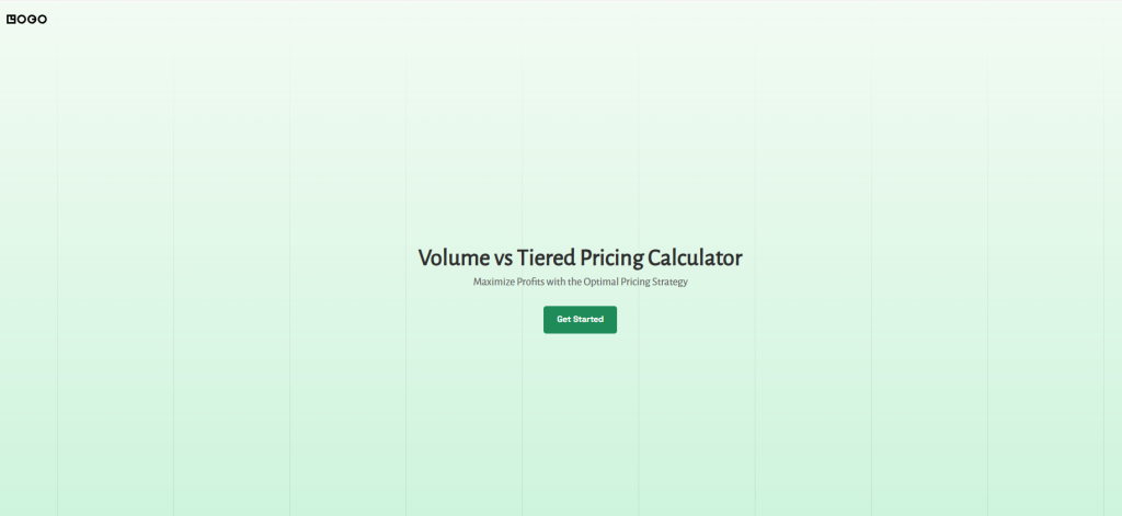
Here’s what makes Outgrow the right platform for pricing calculators specifically:
No-code builder with conditional logic
Build calculators that adapt to buyer inputs in real time, showing different outputs, recommendations, or CTAs based on what the user enters. No developer required.
Native CRM integrations
Every calculator submission flows directly into Salesforce, HubSpot, Marketo, or your CRM of choice, with calculator outputs mapped to custom fields. Your sales team sees team size, current platform, and estimated budget before they ever make a call.
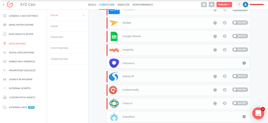
Lead capture with partial gating
Show enough output to create desire, then gate the detailed breakdown behind a lead form. Outgrow’s gate placement is fully configurable, so you control exactly where the wall goes.
Mobile-first rendering
Every Outgrow calculator is responsive by default. Sliders, steppers, and dropdown inputs are all optimized for thumb-first interaction, so you don’t lose mobile visitors at the input stage.
A/B testing and analytics built in
See completion rates, drop-off points, and lead capture rates for every calculator you publish. Test different input sets, output formats, or CTA copy without rebuilding from scratch.
Shareable result URLs
Every Outgrow calculator can generate a unique URL for the current result state, so buyers can share their estimate with colleagues and re-engage later exactly where they left off.
Companies like Salesforce, Samsung, and Vodafone use pricing tools, ROI calculators, and product recommendation engines that generate leads, accelerate decisions, and give sales teams better pipeline data.
If you’ve been sending buyers to a static pricing page and wondering why conversion rates are flat, this is the fix.
Best Practices for High-Converting Pricing Calculators
Keep Inputs Minimal
The most effective pricing calculators ask for three to five inputs at most. Each additional input is a potential abandonment point. If your pricing genuinely requires more information to estimate, consider a progressive disclosure model: ask the essential inputs first, surface a rough estimate, then offer to refine it with additional detail.
Show Real-Time Updates
Output fields that update as the user moves a slider or changes a dropdown create a sense of immediacy and interactivity that static forms can’t match. Real-time updates also encourage exploration. Buyers are more likely to test different scenarios when the feedback is instant.
Use Visual Savings Breakdowns
Numbers are harder to process than visuals. A bar chart showing the cost of your product versus the competitor, or a donut chart breaking down where the savings come from, creates emotional legibility. Buyers remember a visual savings breakdown far longer than a row of numbers in a table.
Add Strong CTAs After Results
The results screen is the highest-intent moment in the calculator journey. Place your primary CTA directly below or beside the output. Don’t make the buyer scroll back up to find a button. Put it where their eyes already are.
Optimize for Mobile Devices
Test every input interaction on a phone. Replace multi-column inputs with single-column flows. Replace text inputs with sliders or steppers where possible. Ensure the results screen is fully readable without horizontal scrolling. A pricing calculator that’s frustrating on mobile loses customers who are evaluating you on their phone, which is a significant share of your mid-funnel traffic.
Make Results Shareable
Add a “Share this estimate” button that generates a unique URL for the current calculator state. This lets buyers share with colleagues who need to approve the decision and creates a re-engagement mechanism. A buyer who shares their estimate is implicitly continuing the evaluation and inviting others into it.
Conclusion: The Calculator Is the Conversion
Buyers don’t convert because they read a good pricing page. They convert because they stopped feeling uncertain. A pricing comparison calculator is the most direct tool you have to replace that uncertainty with a number, a comparison, or a savings figure that belongs to them specifically.
The 12 examples in this article share a common thread. Whether it’s AWS letting engineers export a full cost model, Asana showing a 50-seat team exactly how much they’d save in a year, or Outgrow proving that switching from Typeform doesn’t just cut costs but grows pipeline, the best calculators do one thing exceptionally well: they make the decision feel obvious.
That’s not a coincidence. It’s design.
The companies that win mid-funnel don’t ask buyers to trust a pricing table. They give buyers a tool that does the math for them, surfaces the delta, and hands them something they can share with a manager, forward to procurement, or screenshot for a Slack thread. That artifact is what moves deals forward.
The question isn’t whether your pricing page needs a calculator. If you have variable pricing, multiple tiers, a competitor you’re trying to displace, or a sales team spending hours answering “what will this cost us?”, the answer is already yes.
The question is whether you build it in a way that actually converts.
Frequently Asked Questions
A pricing calculator estimates cost for self-service evaluation. A quote calculator generates a formal proposal and triggers a sales workflow, placing it further down the funnel.
No. Healthcare, financial services, professional services, and e-commerce all benefit from them. Any product with variable pricing or competitive switching decisions is a good candidate.
Three to five inputs is optimal. More than seven significantly reduces completion rates. Use progressive disclosure if your pricing logic genuinely requires more information.
Not always. Price ranges like “from $X/month” are often more appropriate, especially where final pricing depends on negotiation, volume discounts, or custom configurations.
Pricing pages, competitor comparison pages, PLG onboarding flows, and sales follow-up emails are the four highest-performing placements.
Yes. Interactive content generates 2x the engagement of static content, and pricing calculators reduce uncertainty, which is the primary cause of delayed purchasing decisions.
Minimal inputs, real-time output updates, visual savings breakdowns, a strong CTA on the results screen, and full mobile optimization are the five highest-impact factors.
Yes. Platforms like Outgrow integrate natively with Salesforce, HubSpot, and Marketo, passing calculator outputs as custom fields on lead records.
Use a hybrid approach. Show a basic estimate ungated. Gate the detailed breakdown or downloadable report to capture high-intent leads without sacrificing top-of-funnel reach.

Ankit Upadhyay is a Digital Marketing and SEO Specialist at Outgrow. With a passion for driving growth through strategic content and technical SEO expertise, Ankit Upadhyay helps brands enhance their online visibility and connect with the right audience. When not optimizing websites or crafting marketing strategies, Ankit Upadhyay loves visiting new places and exploring nature.