
Summarize with :
10 Interactive Content Placement Ideas You Can’t Go Wrong With
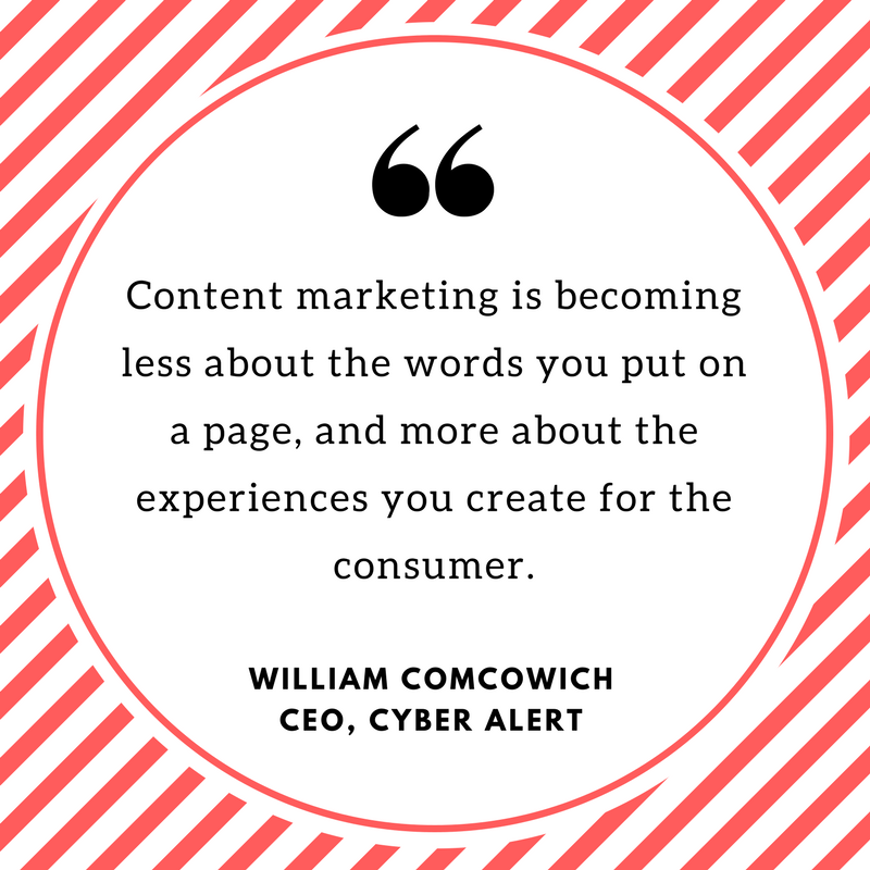
The internet is swamped with content. As a marketer, you have 2 options: keep churning out blogposts which most of your audience don’t read or put an end to the content fatigue with interactive content? Think. Real. Hard. I hope you pick the second option because interactive content is a major differentiator and, as William Comcowich, the CEO of Cyber Alert says, “Content marketing is becoming less about the words you put on a page, and more about the experiences you create for the consumer.”
Interactive experiences like quizzes, polls, calculators, online surveys and assessments generate phenomenal engagement. And, that’s only the tip of the iceberg! There’s plenty that happens once you publish these interactive experiences: you initiate a dialogue, educate buyers, establish a connection, enhance brand recall, and get ample social shares! Don’t believe us? Take a look at the results of a research study conducted by Content Marketing Institute!
Now, if you are already creating interactive experiences, you’re on the right track! However, did you know that just publishing these experiences isn’t enough? You must think about where it could go on your website and social media channels. To help you out, we’ve compiled a list of 10 interactive content placement ideas you can’t go wrong with!
#1 Hello Bar
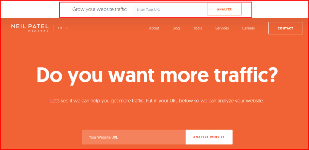
Hello bar, a conversation starter tool, is a great way to grab readers’ attention and encourage them to take a certain action. For Neil Patel, it helped generate 11% leads on Quick Sprout [source]. No wonder content marketers followed suit and it makes sense that you do too.
One of the reasons why a hello bar performs well is its simplicity, both design-wise and in terms of its functionality. It is easily noticed and, unlike the in-your-face pop-ups, it isn’t distracting or salesy. See the screenshot below of a hello bar on Neil Patel’s website.
Through a hello bar you can educate your users and get them interested in your products and services. A lot of business owners use it to make product announcements; e-commerce websites use it to notify visitors about a time-sensitive offer and some also use it to increase email subscribers, and social interaction. But, instead of following the usual path and keeping your objective in mind, you can link your hello bar CTA to a quiz, a calculator, or an assessment. It will definitely improve the quality of a visitor’s experience on your website. And once you’ve set up the hello bar do split-test it. Try different variations of the bar color, CTA button size and the text too. It will help you understand which version is converting better.
#2 On the Home Page as a CTA
Your website’s homepage is what gets the most traffic and attention on your entire website. It is where a visitor’s interaction with you begins and they come to know more about your brand better. For this interaction to be interesting and memorable, how about using interactive content? It generates conversions 70% of the time as compared to passive content! You can have interactive experiences as primary or secondary CTAs on your website homepage. While the users get busy finding their results you will have your hands full with customer data to work on!
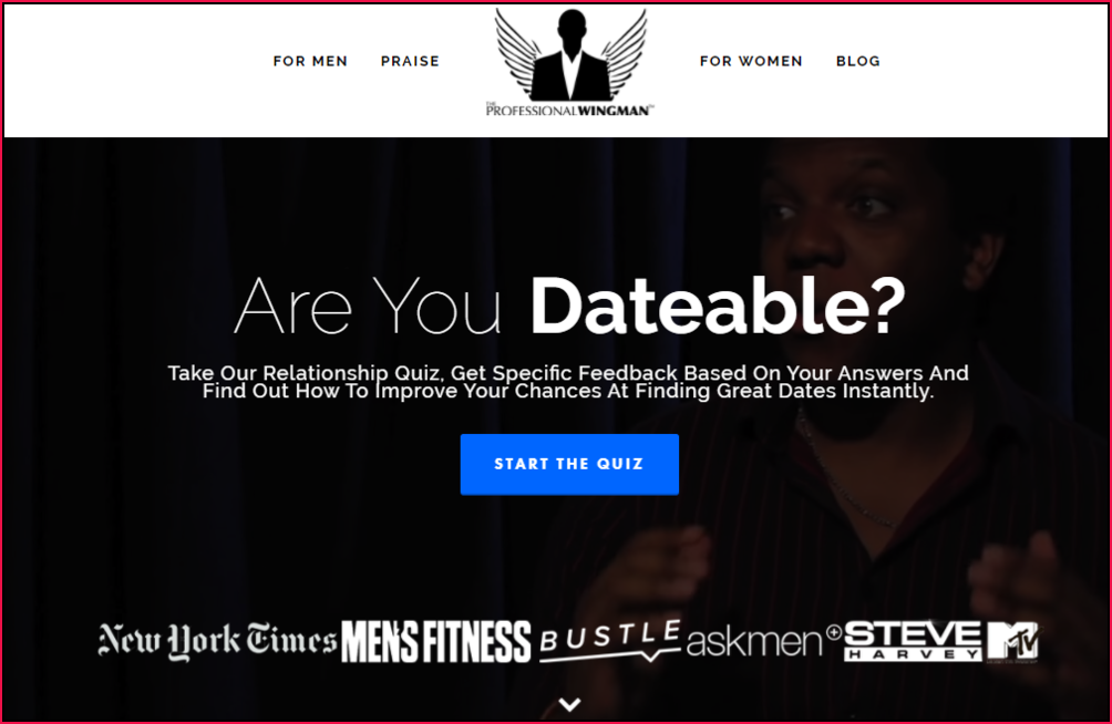
Have a look at the primary CTA on The Professional Wingman website. Although they could have easily posted uninspiring, boring static content (yawn!) but they chose to engage visitors through an interactive quiz.
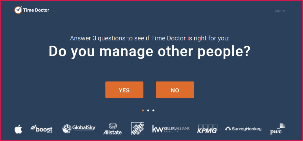
You can find another example of interactive content being used as primary CTA on the Time Doctor website:
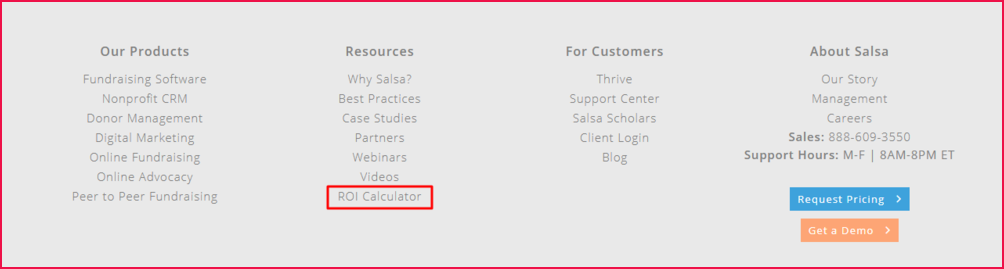
On the other hand, team Salsa uses interactive content as a secondary CTA. Usually, secondary CTAs are what Hubspot calls “a contingency plan”. You should think of offering another path to visitors who aren’t yet ready for commitment. This way they are still with you until they are convinced to take a decision.
#3 On the Side bar
There’s another spot where you can publish interactive content – the sidebar. BuzzFeed populates its sidebar with a mix of content – listicles and quizzes – and has been able to successfully generate buzz year after year! In fact, in March 2017 their top 4 stories were quizzes.
What makes interactive content work is that it’s a perfect blend of visuals and text that makes it visually engaging. The user also doesn’t have to commit more than a few seconds to complete a quiz or an assessment. From start to finish it’s a quick process and gives immediate value and gratification to the user.
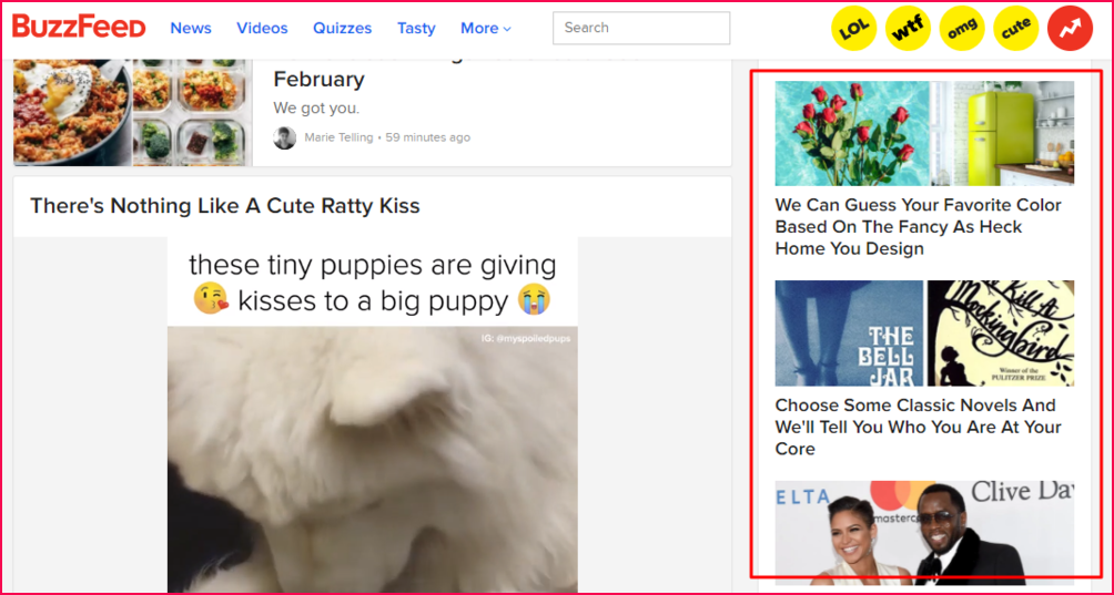
But why the sidebar, you may ask. As per the eye tracking heatmap, people digest content in F-shaped patterns but then it also says that we like to consume chunks of information. And, sidebar is a great alternative to attracting a website visitor’s attention. Even Neil Patel believes in having a sidebar and justifies his reason in a blog post! The point is to retain a website visitor however you can!
#4 On Landing Pages
Landing pages are meant to facilitate a specific action you want users to take. But you should also keep in mind that consumer behavior is ever-changing in this digital era. Your audience wouldn’t respond to traditional marketing techniques. So, rethink your strategy and do away with the idea of winning them over with passive content. Instead get the conversation started through interactive content. Since it is a healthy mix of images and text the likelihood of it being shared are more. Wonder how? There’s research that proves that visual content gets 94% more total views and is 40x more likely to be shared on social media!
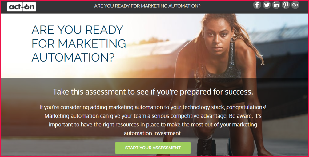
Act-on uses an assessment tool on their landing page, inviting their audience to test if they are ‘ready for marketing automation’. It’s definitely a strategic way of drawing them further into the conversion funnel without explicitly asking them!
#5 On the Exit-intent Pop-up
An exit-intent popup is a smart marketer’s saved-for-the-last trick to increase conversions. It’s a second chance to win back a user’s attention and recover about 10-15% of almost lost visitors! But, for it to work its magic the content and CTA has to be compelling enough for the user to re-engage and do what you’re politely asking them to.

#6 Embed on your Blog
An analysis of 100 million articles by BuzzSumo and OkDork revealed that 8 out of 10 most shared Buzzfeed articles were quizzes. Crazy, right? They do tend to spread like wildfire, captivating everyone! Think of how easily you can also leverage this benefit of interactive content by simply embedding it in an article or your blog!
In a way, you use the informational medium – your blog – and turn it into an information collection channel. How? Well, think about the number of people who will take the quiz or use the calculator and the data they input. You can use this data to fuel your marketing efforts! Another bright side to embedding interactive experiences on your blog is that you don’t risk losing your audience. Right from people liking and sharing it to commenting on it, everything will happen on the very blog post! Wohoo!
#7 On the Pricing Page
People generally check pricing pages for two reasons. One is to find out if you actually fit their budget and second to compare you with your competitors before making a purchase decision. The pricing pages that actually win over visitors are those that make decision making easier. Typically these pages have an excellent header copy, clean layout, simple language and inspire some degree of trust in the visitor without overwhelming them with too much information or choices.
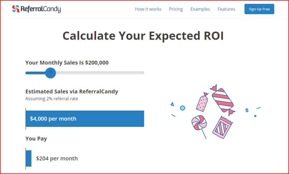
While you may have cut a perfect copy of a pricing page you can go one step ahead by replacing standard pricing tables with a calculator. According to the Demand Gen Report in 2015, “nearly 25% of survey participants said that they had used ROI calculators to research B2B decisions and about 40% respondents gave calculators 4 out of 5 in terms of how helpful they were to them during the purchase process. The reason many prospects find calculators useful is that it helps them get a rough estimate of what something is going to cost them before they actually make a purchase decision. In addition, they can explore their options and at the same time evaluate you against your competitors. Here’s an example of a calculator used on the pricing page of ReferralCandy website:
Related Read: How to build a ROI calculator?
#8 On Facebook’s Custom Tab
Food52’s quiz, “Which cake are you?” got thousands of shares and attracted an audience of 20,000 to their website within three days! This could be you. While they just shared it on social media, you have the option to place your quiz on your brand’s Facebook page! The best part is that because it is a tab it doesn’t go unnoticed unlike a post that gets buried under other posts. This means anyone who checks out your Facebook profile can see it and obviously give into the temptation that a quiz is! Embedding a quiz on a custom tab is fairly simple!To get started, you should first create a custom tab on your Facebook business page. You can learn how to do so through the video posted below.
#9 On Twitter
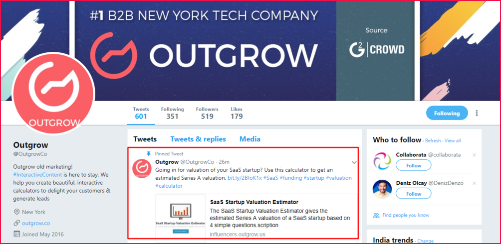
Did you know ‘engaging’ questions get 1,050% more replies than quotes on Twitter? Such questions also get 100% more comments than a standard text-based post. Clearly, this suggests that probing people and asking them questions is a great way to start communicating with them. This is why we highly recommend you start posting interactive content i.e. calculators, polls, assessment and quizzes on Twitter! After all, each of them probes your audience in some way!
You can tweet interactive experiences as links (chances of retweets are 86% more) since you want to drive social traffic to your website. Or you can pin the tweet on your profile page (screenshot below). Choose the featured image carefully (images tend to get 18% more clicks than a text-only tweet) and create a perfect, under-100 characters tweet since they tend to get 17% more engagement!
#10 In Emailers
Email marketing has time and again proven to be one of the most effective online marketing strategies. As per a McKinsey report, an emailer is 40 times more effective at acquiring customers than Twitter or Facebook! Also, for every $1 spent, email marketing generates $38 in ROI! If this is the case then interactive content deserves a spot in your next emailer. The interactive content link could either take them to a blog/article where you have embedded the quiz or to a landing page. And, before we forget, think of a crispy, personalized subject line for the email campaign as they are 26% more likely to be opened.
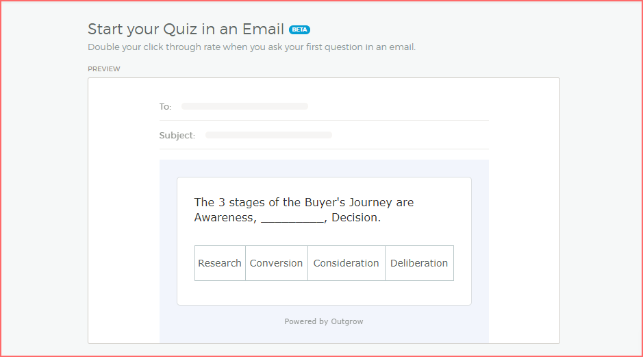
Another interesting way of making your newsletters super interesting is by triggering an event within the emailer. This is to say that instead of driving the traffic to a landing page you bring the landing page into their inbox! MailChimp was able to help clients collect reviews for their products by developing an interactive element within the email. Surprisingly, the conversions doubled as there were fewer clicks and no redirections!
If you’re an Outgrow user, you’d know that we’ve introduced the ‘launch in email’ feature (beta) as a part of our recent product update. It lets you ask the first question of your quiz/calculator in the email itself.
Over to you guys. Do you already post interactive content on your site or blog? How has it worked out for you? Let us know in the comments below.
If you are new to creating and publishing interactive content then here’s me hoping that these examples really help you strategize better. Give your readers content that adds value and engages them. With that taken care of, we’re sure that you will see improved engagement rates and also gain quality leads for your business!

![How to Create a Covid Risk Assessment Tool [+Template Inside]](https://outgrow.co/blog/wp-content/uploads/2021/08/Copy-of-Blue-Orange-Photo-Pattern-Food-Facebook-Cover.jpg)
2 Comments